UI for the Fill Symbol Editor
Below shows the UI of the Line Symbol Editor:
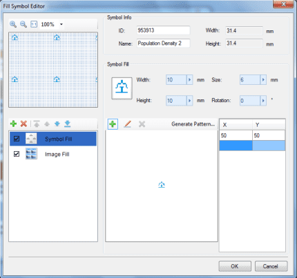
- Symbol Information: This area is for displaying and setting the properties of a fill symbol, including its code, name, height, and width.
- Child Fill Manager: The Child Fill Manager is composed of a child fill manager toolbar and a child fill list. It is used to manage child fills that constitute a fill symbol. A fill symbol consists of one or more child fills. Operations for managing child fills include: adding and removing child fills, controlling the visibilities of child fills, setting the types of child fills, and adjusting the order of child fills.
- Preview Area: This area displays the effect of using the fill symbol created or edited by the user to fill a region. It also provides a zooming function for previewing the effect of applying a fill symbol.
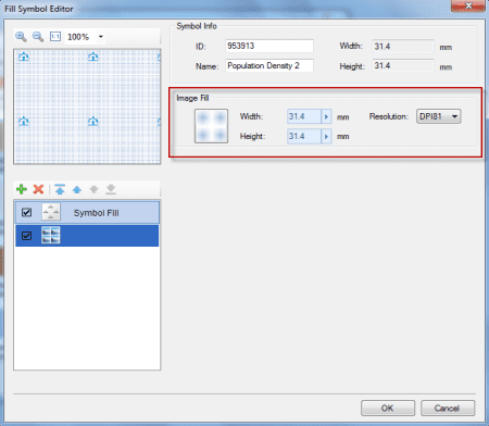
- Child Fill Setting area: The styles of child fills are set here. There are two types of child fills: image fills and symbol fills. When a different type of child fill in the child fill list in the Fill Manager is selected, the corresponding content displayed on the right of the Child Fill Setting area would be different. The (left) figure below demonstrates the Child Fill Setting area when a symbol fill in the child fill list is selected. And the (right) figure below demonstrates the Child Fill Setting area when an image fill in the child fill list is selected.
The following content describes the usages of some functions in the Fill Symbol Editor. Other functions in the Fill Symbol Editor are described in other parts of the help document. Please search other sections of the help document for those descriptions.

|

|
|---|---|
| Illustration of the structure of the Fill Symbol Editor | The Child Fill Setting area for an image fill |
Browsing Operations in the Preview Area
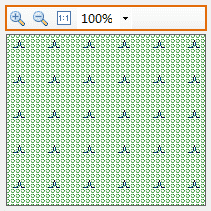
In the Preview Area in the Fill Symbol Editor, the toolbar on the top of the preview window provides tools for scaling and previewing the effect of applying fill symbols. Below are the detailed descriptions of the functional buttons.
The zooming tool provided in the Preview area for previewing a fill symbol can display, with a prescribed zooming ratio, the effect of applying a fill symbol to a fill region. The prescribed ratios include: 50%, 75%, 100%, 200%, and 400%.
- Zoom in: Click the button to magnify the display in the preview window that shows the effect of applying the fill symbol. One click on the Zoom In button makes the view at the current prescribed ratio change to the next larger prescribed ratio. You can keep clicking the button till the ratio reaches the maximum value.
- Zoom out: Click the button to shrink the display in the preview window that shows the effect of applying the fill symbol. One click on the Zoom Out button makes the view at the current prescribed ratio change to the next smaller prescribed ratio. You can keep clicking the button till the ratio reaches the minimum value.
- 1:1: Click this button to display the effect of applying the fill symbol in the current preview area with the ratio of 1:1.
- Display Ratio Drop-down List: The ratios shown in the Display Ratio drop-down list are the ratios for displaying the effect of applying the current fill symbol. Select a prescribed zooming ratio from the Display Ratio drop-down list to scale and display the effect of applying the current fill symbol. In addition, when clicking the Zoom In button, the Zoom Out button, and the 1:1 button, the zooming ratio in the Display Ratio drop-down list will automatically change accordingly.
