


Feature Description
A heat map is a cartographic technique that intuitively presents data (such as crowd distribution, density, trends, etc.) through color distribution. Its core principle involves creating a buffer for discrete points and filling the buffer from the inside out, from light to dark, using a progressive grayscale band (0~255). The color at any location on the map is determined by the sum of the overlapping buffer colors from all points at that location. A higher overlay value indicates greater point density at that location. Heat maps not only reflect the relative density of point features but can also more precisely express density distribution through attribute weighting (e.g., point weights).
Furthermore, a heat map is a dynamic raster surface that updates with map zooming. For example, a national tourist attraction passenger flow heat map can show the passenger flow distribution of a province or local area after zooming in. This method transforms discrete points into a continuous, colored surface that is easy to observe for density changes.
Heat maps are suitable for scenarios such as analyzing aggregation areas of point features, displaying density change trends, and assisting in commercial site selection or public facility planning.
Only point datasets are supported for creating heat maps; when using heat map rendering, the map's Alpha Channel needs to be enabled to support translucent effects.
Functional Entrance
Select the point data layer for which you want to create a heat map in the Layer Manager:
- On the Thematic Map tab -> Aggregation Map group -> click the Heat Map button.
- Right-click the layer, select Create Thematic Map ... from the context menu, and in the pop-up Create Thematic Map dialog, choose Aggregation Map -> Heat Map.
Operating Steps
- A heat map thematic layer will be generated in the Layer Manager.
- Select the heat map layer, right-click and choose the Modify Thematic Map command. The Layer Properties panel will appear on the right side of the map, displaying the current heat map settings.
- You can modify basic functions of the heat map layer, such as display control and changing the dataset, in the Layer Properties panel.
- Display Control: Allows viewing and setting layer visibility, layer name, layer caption, transparency, and maximum and minimum visible scales.
- Visibility: Used to set layer visibility. If checked, the layer is visible on the map; if unchecked, the layer is invisible.
- Layer Name: Displays the selected layer name, which is the unique identifier of the layer in the map and cannot be modified.
- Layer Caption: Displays the selected layer caption, which can be modified. After modification, the display name of the layer in the Layer Manager will change accordingly, but the layer name remains unchanged.
- Transparency: Used to set the display transparency of the layer. The value range is 0~100, where 0 means completely opaque and 100 means completely transparent.
- Minimum Visible Scale: The combo box is used to set the minimum visible scale for the current layer. After setting the minimum visible scale for the layer, if the map's scale is smaller than the set minimum visible scale, the layer will be invisible. For specific operations, please refer to Set Layer Visible Scale Range.
- Maximum Visible Scale: The combo box is used to set the maximum visible scale for the current layer. After setting the maximum visible scale for the layer, if the map's scale is greater than or equal to the set maximum visible scale, the layer will be invisible. For specific operations, please refer to Set Layer Visible Scale Range.
- Change Dataset: Click the drop-down arrows on the right side of Datasource and Dataset respectively to select the dataset to be referenced and the data source where the dataset resides. For more information, please refer to: Change Dataset.
- Display Control: Allows viewing and setting layer visibility, layer name, layer caption, transparency, and maximum and minimum visible scales.
- Parameters: You can set parameters for the heat map layer such as Kernel Radius, Weight Field, Color Scheme, Color Gradient Blur, Maximum Color Weight, and Extremum. These parameter settings will determine the display effects of the heat map. The detailed descriptions are as follows:
- Kernel Radius: Sets the influence radius for discrete points. The role of the kernel radius in a heat map is described below:
- The heat map will create a buffer for each discrete point based on the set kernel radius value. The unit of the kernel radius value is: screen coordinates.
- After creating buffers for each discrete point, fill each point's buffer from the inside out, from light to dark, using a progressive grayscale band (the full grayscale band is 0~255).
- Since grayscale values can be superimposed (a higher value indicates a brighter color, appearing whiter in the grayscale band. In practice, any channel in the ARGB model can be chosen as the superimposed grayscale value), for areas where buffers intersect, grayscale values can be superimposed. Therefore, the more overlapping buffers, the greater the grayscale value, making the area "hotter".
- Using the superimposed grayscale value as an index, map colors from a color band with 256 colors (e.g., rainbow colors) and recolor the image to achieve the heat map.
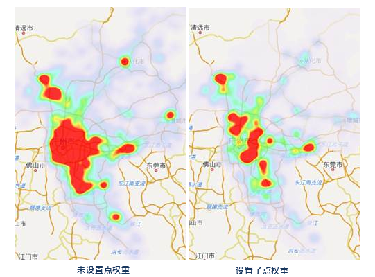
- Weight Field: Used to determine the influence of points on density. The weight value of a point determines its buffer's influence on density. That is, if the original influence coefficient of a point buffer is 1 and the point's weight value is 10, then after introducing the weight, the influence coefficient of that point buffer becomes 1*10=10. The density influence coefficients of other discrete point buffers are calculated similarly.
After introducing weights, a new index of superimposed grayscale values is obtained, and then the specified color band is used to color it, thereby achieving a heat map with introduced weights.
Notice Fields in the drop-down list are displayed by default as field aliases. If needed, you can switch to field names in the File tab -> Options group. For details, please refer to the Preference Settings document. The field used as weight must be a numeric field.
- Aggregate: When a Weight Field is specified, you can specify the aggregation method for the points of that field. Five aggregation methods are provided: Average, Count, Maximum, Minimum, and Sum.
- Set Color Scheme: The combo box drop-down list lists the color schemes provided by the system. Select the desired color scheme, and the system will automatically allocate thematic styles corresponding to each rendering field value based on the selected color scheme.
- Minimum Color Transparency: Displays the color and transparency of the current "coldest" area. Adjust the transparency of the minimum color via the numeric combo box on the far right. The default transparency is 100, i.e., fully transparent.
- Maximum Color Transparency: Displays the color and transparency of the current "hottest" area. Adjust the transparency of the maximum color via the numeric combo box on the far right. The default transparency is 10.
- Vertex Color: Supports selecting the displayed vertex color, offering two types: HSB and RGB.
- Color Gradient Blur: Used to adjust the blur degree of the color gradient in the heat map, thereby adjusting the rendering effect of the color band.
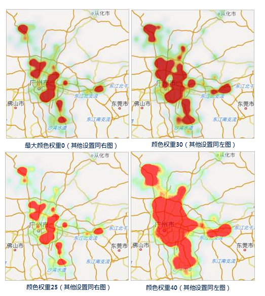
- Maximum Color Weight: Determines the proportion of the maximum value color in the gradient color band. A larger value indicates a greater proportion of the maximum value color in the color band.
- Original Point Visible Scale: Sets the visible scale range for the point dataset layer that generates the heat map. Click the drop-down button of the combo box; the program provides 10 scale types: 1:50,000, 1:100,000, 1:250,000, 1:500,000, 1:1,000,000, Set to Current Scale, and System Default Scale. You can also custom input a scale to conveniently set the visible scale range for the original points according to mapping requirements.
- System Default Scale: The program calculates a scale based on the current heat map as the visible scale for the original points. The original points are invisible at scales smaller than the system scale and visible at scales larger than the system scale.
- Set to Current Scale: Sets the current map's scale as the visible scale range for the point dataset layer. The original points are invisible at scales smaller than the current scale and visible at scales larger than the current scale.
- Extremum Value Settings:: Sets the maximum and minimum values for the heat map display. The maximum value corresponds to the maximum color, and the minimum value corresponds to the minimum color. The rendering color band is constructed based on the relationship between the two. Areas with values greater than the maximum value will be rendered with the maximum color, and areas with values less than the minimum value will be rendered with the minimum color.
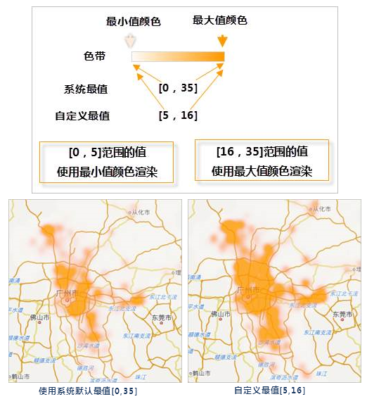
- The Extremum Value of the View: Uses the data extremum within the current window as the rendering basis, dynamically adjusting with view changes.
- The System Extremum Value: By default, the system calculates a default maximum and minimum value for the heat map based on the current map scale (the system maximum and minimum values will change according to the map scale).
- Custom Extremum: Adjusts the distribution of the maximum and minimum colors of the heat map by customizing the maximum and minimum values. The rendering color band is constructed with the relationship where the maximum value corresponds to the set maximum color and the minimum value corresponds to the minimum color, then the heat map is colored accordingly.
- Display Filter: Sets the points participating in the heat map creation through the custom expression field, meaning only points that meet the expression field are used to create the heat map. Click the ... button after the input box to pop up the SQL Expression dialog. For SQL function input, please refer to SQL Expression. For some datasets with large data volumes, using the Display Filter can improve map display performance.
- Kernel Radius: Sets the influence radius for discrete points. The role of the kernel radius in a heat map is described below:
- Through the above parameters, a heat map based on a point dataset is completed.
Application Example
Case Description
Taking the distribution of national cultural and educational institutions as an example, a heat map is created using point data of national cultural and educational institution distribution to reflect their distribution in China.
Data Description
- National cultural and educational institution distribution point data, including institution names and types, used to create the heat map layer.
- Chinese administrative division polygon data, Chinese national boundary line data, and world country polygon data, used to create the base map for the heat map.
- Chinese highway line data, combined with the heat map to reflect institution distribution characteristics.
The data used in this case is located in SuperMap Sample Data SampleData\AggregationMap\HeatMap and requires downloading an independent installation package. For details, please refer to Get Sample Data Package.
Main Operating Steps
- Open the workspace Sample Data\AnalyticalMap\HeatMap\HeatMap.smwu.
- Add Chinese administrative division data, Chinese national boundary line data, and world country polygon data to the map, and set the styles for these layers respectively; then create a single symbol label thematic map using the Chinese administrative division data, with the label expression as Name.
- Then add the cultural and educational institution distribution point data to the prepared base map. Right-click this layer in the Layer Manager and select Create Thematic Map.
- In the pop-up Create Thematic Map dialog, select Aggregation Map -> Heat Map, and click OK. The system will generate a heat map according to the default parameters.
- Then, according to display requirements, set parameters for the heat map layer such as Kernel Radius, Weight Field, Color Scheme, Color Gradient Blur, Maximum Color Weight, and Extremum. This completes the creation of the national cultural and educational institution distribution heat map.
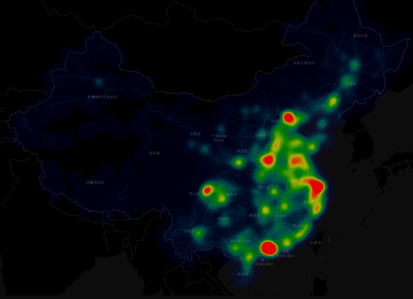 |
| Figure: National Education Institution Distribution Heat Map |
Related Topics