


When designing map colors, four vertex colors are available: RGB mode, CMYK mode, HSB mode, and LAB Mode. If the map is for browsing on a computer or publishing as a web map service, RGB mode can be used for coloring; however, if the map needs to be printed, it is recommended to choose CMYK mode for map color matching, as CMYK is the printing color mode. In HSB mode, H, S, and B represent hue, saturation, and brightness respectively, defining vertex color from a visual perspective. Higher values of S and B indicate higher saturation and brightness, resulting in more vivid colors. LAB Modecompensates for the shortcomings of both RGB and CMYK color modes. It consists of three channels: one for lightness (L), and two color channels (A and B). Channel A ranges from dark green (low brightness) to gray (medium brightness) to bright pink (high brightness); channel B ranges from dark blue (low brightness) to gray (medium brightness) to yellow (high brightness). Thus, mixing these colors produces bright hues. When setting specific colors, the choice of mode depends on practical circumstances.
In the examples below, the color illustrations will use vertex color values based on the content, not limited to fixed vertex colors. In actual cartography, we typically encounter three scenarios for point symbol settings.
System Symbol
POI points have a large data volume but no clear classification. For this situation, when setting the dataset style, we generally select system symbols (SuperMap's system symbols include squares and circles), and then set the symbol color and size. The symbol size can be configured according to map requirements; the symbol color should also be set based on the map background color. If the background is very light, the symbol color can be darker; if the background is strong, bright colors with high purity and saturation are advisable. As shown below:
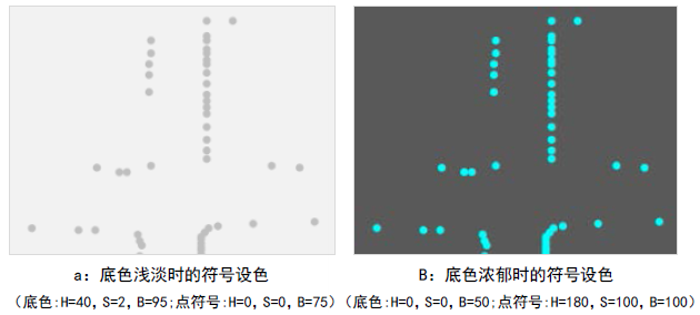 |
| Figure: Comparison of map background color and symbol color |
From color settings on online maps like Google, Baidu, and Tencent, we see that public maps prioritize overall comfort and harmony over vividness. Large areas use low-saturation gray tones, such as administrative divisions. If our base map follows this scheme, it is recommended to use low-saturation colors from the same series for symbols (Note: S=0 in HSB represents gray), as illustrated above.
Vector Symbol
Point symbols are vector symbols, each with distinct meanings, fixed marker sizes, and color settings. These are common in industry maps, such as surveying maps or water facility maps. As shown below.
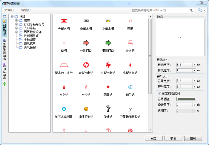 |
| Figure: Vector symbol illustration |
As seen above, the main part of point vector symbols usually employs high-purity colors, while different hues can represent subtypes within the same category. For example, flood diversion gates and flood return gates may use the same symbol but different colors—red for diversion and green for return.
However, industry symbols like these have strict color and size requirements, so follow specifications during symbol creation or style settings.
Raster Symbol
Point symbols are represented by figurative raster symbols, a common approach in digital maps. Raster symbols visually convey real objects, so their colors should strive to match actual scenes. For instance, parks use green, while gas stations use blue or orange. As shown below:
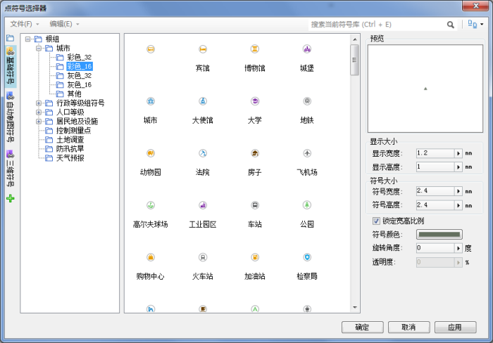 |
| Figure: Raster symbol illustration |
Raster symbol coloring is not absolute but should align with public perceptions of object colors, avoiding excessive novelty. For example, government locations typically use red; green or black would be inappropriate.
Raster symbol size and color must harmonize with the overall map palette. If unsure about color choices, set the main hue to a uniform color, such as gray tones (S=0 in HSB).
SuperMap iDesktopX requires raster symbols to be created in software like Photoshop and imported into the symbol library. This necessitates finalizing colors during production to avoid rework due to mismatched effects. Note that raster symbols often have circular backgrounds, typically white, to contrast with the main color. Additionally, in digital maps, point symbols are usually accompanied by labels, allowing object identification even without figurative symbols—one reason for confidently using default symbols.
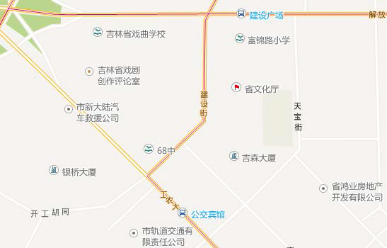 |
| Figure: Application of symbols in maps |
Related Topics
Basic characteristics of color and color psychology