


Linear symbols play a skeletal role in maps, serving as one of the main carriers of map information, such as roads and rivers. They should be highlighted as key elements during map design. Linear symbols are very narrow and elongated; only by emphasizing them with colors can they stand out. Therefore, when designing linear symbols, the line parts should be chosen with high saturation colors. For different grades of linear symbols, it is appropriate to use colors with different hues, brightness, and saturation to represent them. For example, different levels of roads like expressways, national highways, provincial roads, and county roads need to be distinguished by different colors. Some lines can use spot colors, such as urban subway lines and contour lines. Next, we will focus on the color design of several common linear symbols in maps.
Roads
The road color design discussed here is based on a grayish base map color, which is commonly used. If the base map has a dark color scheme, this may not apply, requiring cartographers to match appropriate road colors based on the specific base map to achieve overall map color harmony.
Online maps like Dituhui, Baidu, Tianditu, and Tencent use color settings for different road grades at a scale of 1:50 kilometers. Dituhui, Baidu, and Tencent employ a yellow color scheme for roads, with colors ranging from dark to light based on road grade. Tianditu uses purple for expressways, while other road levels are also represented in yellow.
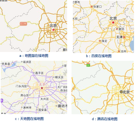 |
| Figure: Color settings for different road grades in web maps |
Online maps like Dituhui, Baidu, Tianditu, and Tencent apply color settings for different road grades at a scale of 1:2 kilometers. Compared to the previous map, roads at this scale are displayed more richly, with expressways, national highways, and provincial roads shown as double lines, still primarily in a yellow color scheme. For double-line color settings, the border color should be darker than the central main color, remaining in the same color family but providing contrast.
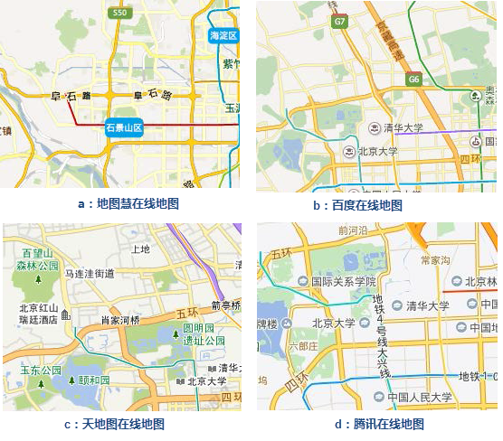 |
| Figure: Color settings for different road grades in web maps |
From the above discussion, it can be seen that color settings for expressways, national highways, provincial roads, and county roads mainly use a yellow scheme. Yellow evokes feelings of lightness, hope, and vitality. As road lines are among the most displayed linear symbols on maps, light and vibrant colors not only enhance map aesthetics but also create a pleasant experience.
Of course, not all road lines can use the yellow scheme at all scales. When dense urban streets appear without focusing on them, low-saturation colors like grays can be used to reduce visual impact.
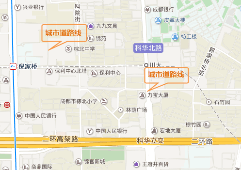 |
| Figure: Color design of urban street lines |
The above figure shows color design for urban street lines at different scales. For single lines, it is set to gray (H=0, S=0, B=79). For double lines, the border is gray and the main color is white. Urban roads are typically crisscrossed, including various streets and alleys; using low-saturation colors reduces visual impact and enhances map readability.
Rail
In digital maps, railway lines are usually represented by alternating gray and white symbols, so color design is straightforward with just two colors: gray and white. As shown in the figure below, gray with H=0, S=0, B=79 is used, and the brightness value (B in HSB) can be adjusted to match the overall map color scheme.
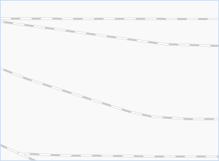 |
| Figure: Railway lines |
Rivers
People generally perceive water systems like rivers and lakes as blue, rather than the yellow, green, or other colors seen in real life (due to environmental factors, not detailed here). Therefore, in digital maps, color design for rivers and lakes primarily uses a blue scheme. Different grades of river lines can be represented with blues of varying saturation and brightness, while public digital maps typically use a single moderate-saturation blue, as shown below.
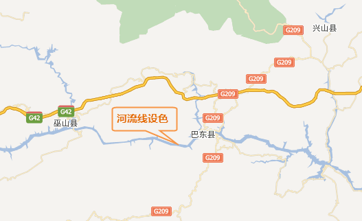 |
| Figure: River color design |
Besides roads, railways, and rivers, there is color design for boundaries like national borders and administrative divisions (provincial, municipal, county, etc.). National borders and administrative division lines are generally gray. To differentiate, such as distinguishing China's borders from other countries, China's borders can use colors from other schemes, like the yellow scheme in Tencent maps. For administrative divisions at different levels, such as provinces, cities, and counties, colors with varying saturation and brightness in the same scheme or different line symbols can be used for distinction.
Related Topics
Basic Characteristics of Color and Color Psychology