


Area features cover large areas, quickly capturing readers' visual attention and influencing their aesthetic interest. Successful color application in areas conveys rich geographic information with minimal map language, clearly, completely, and accurately expressing the map's purpose and design intent. Therefore, color usage for areas should distinguish layers and employ different color values.
Different area features represent distinct properties on a map. The color design for area features should select colors distinct from other symbols based on their nature. Vegetation, water bodies, and urban blocks (or residential areas) are common area features. Generally, vegetation and green spaces use green, while water bodies use blue. Urban blocks can employ different color schemes based on the map's purpose. For example, in topographic maps, urban blocks are gray (K=20), while in administrative maps, blocks belonging to different administrative divisions can be represented with light pink (M=25), light yellow (Y=30), light orange (M=15, Y=30), light purple (C=22, M=28), or light green (C=15, Y=20), all yielding acceptable results.
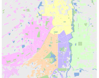 |
| Figure: Design of Different Colors for Different Urban Blocks |
When area features are overlaid with other layers, occlusion may occur. In practical map production, we can achieve a translucent display effect by setting color transparency, especially when overlaying with image data. After enabling 'Alpha Channel' in 'Map Properties', when setting the color for area features under RGB, setting the A (Alpha) value achieves a semi-transparent display effect for color values. The A value ranges from 0 to 100, where 0 represents fully transparent and 100 represents opaque.
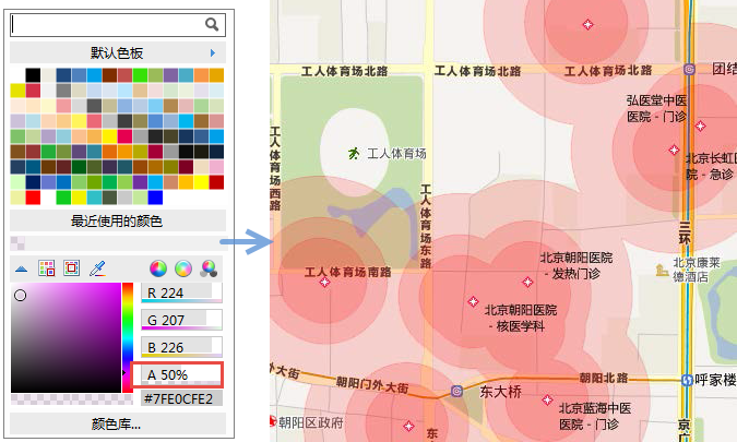 |
| Figure: Setting Map Transparency via A Value |
Related Topics
Basic Characteristics of Color and Color Psychology
Color Design for Point Symbols