


Feature Description
SuperMap Desktop supports creating statistical charts from attribute tables and vector datasets. Available chart types include: Bar Chart, Column Chart, Pie Chart, Line Chart, Bubble Chart, Area Chart, Composite Chart, Scatter Plot, Time Series Chart, Histogram, and 11 other chart types.
Feature Entry
- Method 1: Open a datasource in Workspace Manager, click the Diagrams drop-down button in the Browse group under the Start tab, then select the desired chart type.
- Method 2: Right-click the target dataset in Workspace Manager, choose Add to Chart, and select the desired chart type.
Steps
Creating diagrams requires the following essential steps:
Step 1: Create Chart
Select a chart type to initiate diagram creation. Both methods will open the corresponding chart preview window and properties panel. Users need to configure parameters like Statistic Field and Group Field in the properties panel to complete the diagram.
Step 2: Diagram Parameters
Parameters vary slightly across chart types. Column Charts, Bar Charts, Line Charts, and Bubble Charts share similar parameters. Pie Charts, Area Charts, and Time Series Charts have fewer parameters. Donut Charts, Composite Charts, Scatter Plots, and Histograms each have unique parameter configurations. Parameters are categorized as common and specific below.
Common Parameters
- Data Settings: Select the statistical dataset and its datasource.
- Filter: Set dataset display filters using SQL Query expressions. Refer to Building SQL Query Expressions for details.
- Color: Provides color schemes for statistical items, automatically assigning colors based on item count. SuperMap categorizes colors for DEM, aggregated maps, statistical thematic maps, and unique value maps. Custom color schemes are supported through Color Scheme Manager.
- Show Legend: Toggle legend display via checkbox. Double-click legends to modify styles.
Column/Bar/Line/Bubble/Pie/Area/Time Series Charts
Column, Bar, Line, and Bubble Charts share identical parameters. Pie Charts lack Sort Field and Show Avg Line. Area Charts omit Field 2 in grouping. Time Series Charts exclude Sort Field and Sort Type.
Parameter descriptions:
- Statistic Field: Select dataset attribute fields for statistical measurement (typically Y-axis). Supports multiple fields (e.g., multiple year fields for temporal comparison).
- Aggregation Type: Calculation method for statistic fields. Six types available:
- Count: Counts group field occurrences.
- Sum: Sums selected group field values.
- Average: Computes group field mean.
- Median: Determines group field median.
- Variance: Calculates group field variance.
- STDEV: Computes group field standard deviation.
- Group Field: Attribute field for grouping (typically X-axis). Supports secondary grouping via Field 2 (single statistic field only). Note: Time Series Charts require date-type Group Field 1.
- Sort: Controls X-axis display order using ascending/descending sorting.
- Swap Stats & Group Fields: Exchanges statistic and label field axes when checked.
- Show Avg Line: Displays statistic field averages as reference lines when checked.
Example: To create a Beijing air quality line chart comparing 2014-2016 AQI indices by month: Set month as group field, add three AQI fields as statistics with Sum aggregation. Result shown below:
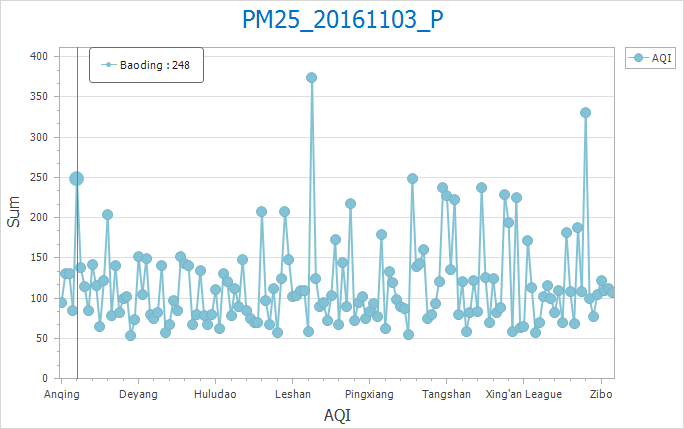 |
| Figure: Diagram Parameters and Results |
Composite Chart
- Group Field: X-axis attribute field.
- Statistic Field: Requires two Y-axis fields (Y1 and Y2). Configure via Statistical Method dropdown.
- Display Method: Supports combining any two chart types from Column, Pie, Line, and Scatter.
Example: Creating a 2014 GDP vs Population composite chart: Set GDP_2014 as Y1 (Column), Pop_2014 as Y2 (Scatter). Result shown below:
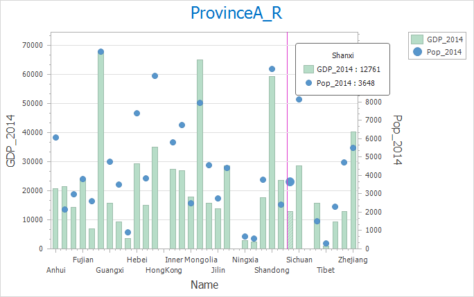 |
| Figure: Composite Chart Parameters and Results |
Histogram
- X-axis Field: Grouping field for X-axis.
- Classes: Number of data bins (determines bar count).
- Decimal Places: Controls X-axis value formatting.
- X-axis Display Mode: Shows left/right interval bounds.
Example: Creating math score frequency histogram: Set scores as X-axis with 6 classes. Result shown below:
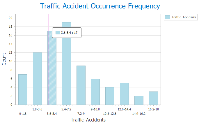 |
| Figure: Histogram Parameters and Results |
Scatter Plot
- X/Y-axis Fields: Numeric fields for coordinate plotting.
- Group Field: Attribute field for point categorization.
- Display Linear Regression: Shows linear regression line via least squares method.
Example: National city income vs expenditure scatter plot: Income (X), Expenditure (Y), Province (Group). Result shown below:
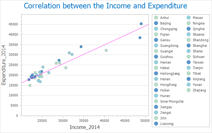 |
| Figure: Scatter Plot Parameters and Results |
Donut Chart
- Statistic Field: Attribute field for measurement.
- Group Field: Multiple group fields create nested rings (first field = inner ring). Adjust order via drag-and-drop.
- Sort Type: Arranges segments by value (ascending/descending).
- Inner Ring Ratio: Controls inner ring proportion.
- Inner Ring Color: Sets inner ring color scheme.
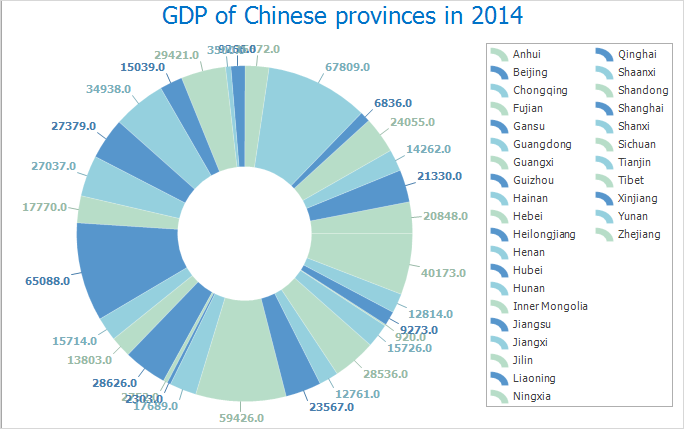 |
| Figure: Donut Chart Parameters and Results |
Step 3: Style Settings
- Display Method: Switch between compatible chart types (e.g., Column ↔ Bar ↔ Line ↔ Pie).
- Background Style: Choose from predefined chart backgrounds via dropdown.
-
Chart title: Supports configuration of the chart title display, including the title name, font, font size, and font color.
-
X-axis title: Supports configuration of the X-axis title display, including the title name, font, font size, and font color.
-
X-axis labels:
-
Supports configuration of the X-axis label display, including the label font, font size, and font color.
-
Supports setting the dimension direction: Provides four display modes—horizontal, vertical, diagonal, and automatic. By default, the automatic mode is enabled. In this mode, the program intelligently selects the most appropriate display direction (horizontal, diagonal, or vertical) based on the actual content of the axis labels and the available space. It prioritizes horizontal display, switches to diagonal if horizontal cannot fully display the labels, and adopts vertical display if diagonal is also insufficient.
-
-
Y-axis title: Supports configuration of the Y-axis title display, including the title name, font, font size, and font color.
-
Y-axis labels: Supports configuration of the Y-axis label display, including the label font, font size, and font color.
-
Custom extremum: Supports setting the maximum and minimum values displayed on the statistical axis, as well as the number of decimal places shown. This controls the display range of the statistical axis, allowing the chart to better represent the effective range of data variation.
Donut Chart Styles
- As Percent: Displays values as percentage of total when checked.
- Show Label: Toggles value labels.
- Label Position: Five options - Inside, Outside, Two Columns, Radial, Tangent.
Step 4: Diagram Processing
Modify Diagram: Click Modify Diagram in the Diagram Processing group under Diagrams tab, or right-click chart window and select Modify Diagram from context menu.
Save Chart: Two methods:
- Method 1: Click Save in Diagram Processing group. Enter name in dialog.
- Method 2: Right-click chart window, choose Save from context menu.
- Saved charts appear under workspace manager's diagram collection node.
- Existing charts will update with modifications upon saving.
Export as Image: Two methods:
- Method 1: Click Export as Image in Diagram Processing group. Select path and filename.
- Method 2: Right-click chart window, choose Export as Image from context menu.
Related Topics
Converting Charts to Thematic Maps