


SuperMap Desktop provides various diagram types to effectively express data insights. Available chart types include column charts, pie charts, line charts, bubble charts, combo charts, scatter plots, time series charts, histograms, bar charts, doughnut charts, and area charts.
This section details the characteristics and application scenarios of each chart type.
Vertical Bar
A column chart uses rectangular bars with proportional heights/lengths to compare multiple variables. It displays data distribution through vertical or horizontal bars of varying heights.
Key features: Enables visual comparison of data magnitudes and facilitates difference analysis. Example: Comparing GDP across provinces as shown below.
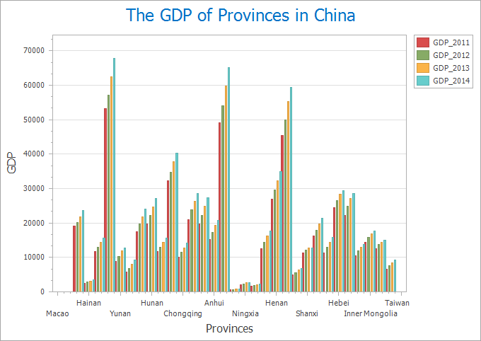 |
| Figure 1: Column Chart |
Pie
A circular chart divided into sectors that represent proportions of a whole. Particularly effective for illustrating percentage relationships between components and the total.
Ideal for showing part-to-whole and part-to-part relationships. Example: Business tax distribution across cities in Sichuan Province (shown below).
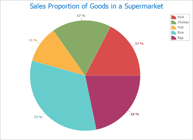 |
| Figure 2: Pie Chart |
Line
Displays quantitative changes through rising/falling trend lines. Compared with column charts, line charts better illustrate temporal developments and continuous data variations.
Advantages: Reveals data trends and dynamic changes. Example: Monthly air quality variations in Beijing (2014-2017) as illustrated.
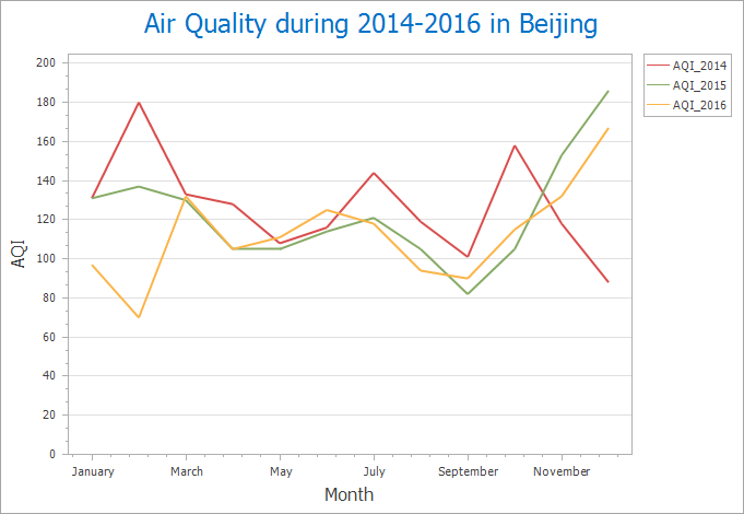 |
| Figure 3: Line Chart |
Bubble
A specialized XY scatter plot where bubble size represents a third variable. X/Y axes determine bubble positions while bubble dimensions indicate additional data values.
Effective for analyzing categorical data correlations.
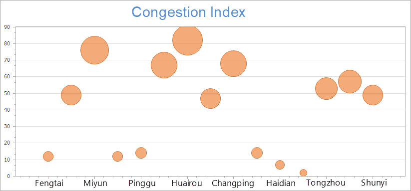 |
| Figure 4: Bubble Chart |
Combo
Combines multiple chart types (e.g., column+line or dual-axis charts) using two datasets with common string fields. Requires at least two distinct datasets for creation.
Useful for examining relationships between different metrics. Example: Analyzing GDP vs population across Chinese provinces (2014).
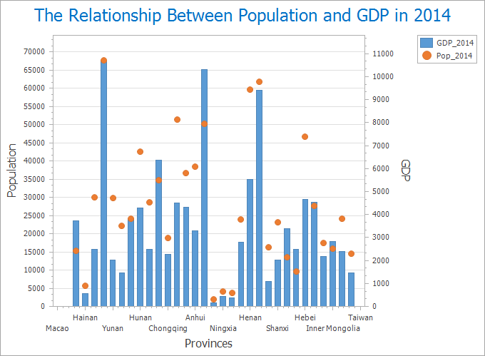 |
| Figure 5: Combo Chart |
Scatter
Plots data points using x,y coordinates to reveal value relationships and trends. Particularly effective for identifying correlations and outliers between variables.
Typical application: Analyzing relationships between metrics like water pipe leakage counts vs total pipeline length in municipal projects.