


The various controls hosted on the Ribbon are Ribbon controls. Ribbon controls can only be placed on the Ribbon-style interface, and the Ribbon can only host Ribbon controls. Ribbon controls include Button, GalleryButton, drop-down button control, CheckBox, ComboBox, and ColorButton. The following sections detail all the Ribbon controls used in the application.
Button Control
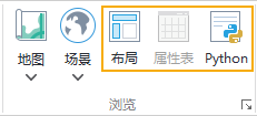
The image below shows the Button control in the application. The display content on a button consists of two parts: the image on the button serves as its display icon, and the text content is its show name. Clicking the button executes the function bound to it.
GalleryButton Control
The GalleryButton control can only be placed within a container control named "Gallery" on the Ribbon. As shown in the figure below, the display content of a GalleryButton control consists of two parts: the image on the control serves as its display icon, and the text content is its show name. The GalleryButton control is similar to the Button control; clicking it executes the function bound to it.

Drop-down Control (RibbonPopupMenuItem)
The image below shows a drop-down button control. The drop-down button consists of two parts: the button part, which can be clicked to directly execute the corresponding function, and the drop-down button part, which when clicked pops up a drop-down menu. Selecting an option from the menu executes its corresponding function. The button part of the drop-down button displays its icon, and the drop-down button part displays its show name.

CheckBox Control
The image below shows the CheckBox control. The text content on a CheckBox is its show name. Users interact with the application by checking or unchecking the CheckBox. The application processes corresponding operations based on whether the CheckBox is selected.
ComboBox Control
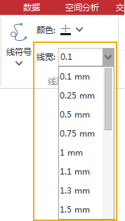
The image below shows a ComboBox control. A ComboBox consists of a text box and a drop-down list containing a series of items. Typically, users can either input content in the text box or select an item from the drop-down list. The application processes operations based on the content displayed in the ComboBox's text box.
ColorButton Control
The image below shows the ColorButton control. The color displayed on the ColorButton is its current color, which is the color selected by the user. Clicking the drop-down button on the right side of the ColorButton pops up a color palette. Users can select the desired color from it. If the color swatches in the list are insufficient, users can click the "Color Library" button at the bottom of the palette to access more colors via the color dialog box that pops up. After the user chooses a color, the current color of the ColorButton changes to the selected color. The color the application retrieves from the ColorButton is its current color.
