


Data visualization is ubiquitous. With the increasing volume and complexity of urban, transportation, and meteorological data, the demand for big data visualization continues to grow, becoming a new way for humans to read and comprehend information. In the GIS field, data analysis through big data visualization enables the extraction of insights from dense and intricate datasets, presenting them visually. This allows readers to immediately grasp spatial distribution patterns, trends, correlations, and statistics information that might otherwise remain hidden in other presentation formats.
Big data visualization achieves real-time display and automatically updates analysis results according to map scale changes. Currently, the application provides convenient data visualization features, enabling one-click generation of heat maps or grid aggregation maps for point data.
Highlights:

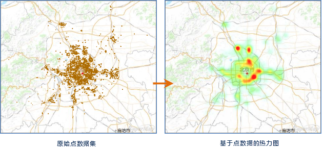
A heat map uses color gradients to represent varying intensity levels of data, such as temperature ranges, density distributions, or access frequencies. It helps quickly extract valuable information from massive datasets and presents it through intuitive visual means, making heat maps an essential big data visualization technique.
 |
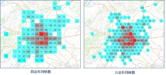
A Grid Aggregation Map employs spatial aggregation methods to display distribution characteristics and statistical features of spatial data. SuperMap provides two grid shapes for aggregation display: rectangular grids and hexagonal grids.
 |