


Four color modes are available for map color design: RGB mode, CMYK mode, HSB mode and LAB mode . If the map is used for browsing on the computer or published as a network Map Service, the RGB mode can be used for map color setting; however, if the map needs to be printed, it is recommended to select the CMYK mode for map color matching, and CMYK is the printing color mode; H, S and B in HSB mode represent hue, saturation and brightness respectively, which is a color mode defined from the visual point of view. The higher the values of S and B, the higher the saturation and lightness, and the brighter the color; LAB Mode makes up for the lack of RGB and CMYK color modes, and consists of three channels, one channel is brightness, that is, L; the other two are color channels, represented by a and B. The channel includes colors from dark green (low brightness value) to gray (medium brightness value) to bright pink (high brightness value); the B channel includes colors from dark blue (low brightness value) to gray (medium brightness value) to yellow (high brightness value). Therefore, this color mixture will produce bright colors. In the specific color design, which mode to use can be determined according to the actual situation.
The color shown in the following examples indicates which color mode value is used, which will be determined according to the content of the introduction and is not limited to the fixed color mode. In the actual drawing process, we usually come into contact with the dot symbol settings of three scenes.
System Symbol
POI points have a large amount of data, but there is no clear classification. In view of this situation, when we set the Dataset style, we usually select System Symbol (System Symbol in SuperMap is divided into square and origin), and then set the color and size of the symbol. The size of the symbol can be set according to the needs of the map; the color of the symbol also needs to be set according to the background color of the map. If the background color is very light, the symbol color can be thick; if the background color is rich, the symbol color should be a bright color with high purity and strong saturation. As shown in the following figure:
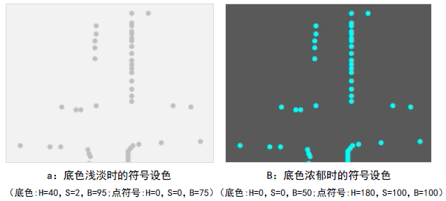 |
| Figure: Comparison of map background color and symbol color |
From the color settings of Google, Baidu, Tencent and other networks Online Map, we can see that the public map does not pursue the bright color, but the overall comfort and harmony. The colors used in a wide range of areas are gray with low saturation, such as administrative divisions. If we refer to this color when drawing, it is recommended to use the color with low saturation in the same series (note: in HSB, S = 0 is gray), as shown in the figure above.
Vector Symbol
The dotted symbol is Vector Symbol. Each Vector Symbol represents different meanings, including fixed Marker Size and Color Settings, which are generally industry maps, such as surveying and mapping maps, water conservancy facilities maps, etc. As shown in the following figure.
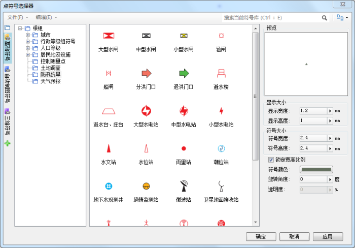 |
| Figure: Vector Symbol Schematic |
It can also be seen from the above figure that in general, the main part of the dotted Vector Symbol is selected with higher purity, and different types of symbols of the same category can be represented by different hues. For example, the flood diversion gate and the flood withdrawal gate in the figure can use the same symbol, but the color is different. The flood diversion gate is red and the flood withdrawal gate is green.
However, the industry symbols shown in the figure above have strict requirements for Color and size. When making symbols or Symbol Style Settings, you can follow the requirements.
Raster Symbol
The dotted symbol is represented by the image of Raster Symbol, which is a common way in Digital Map. Raster Symbol can vividly convey the real object you want to express, so you should also strive to be close to the real scenery in color. For example, parks are represented by green, gas stations are represented by blue or orange, etc. As shown in the following figure:
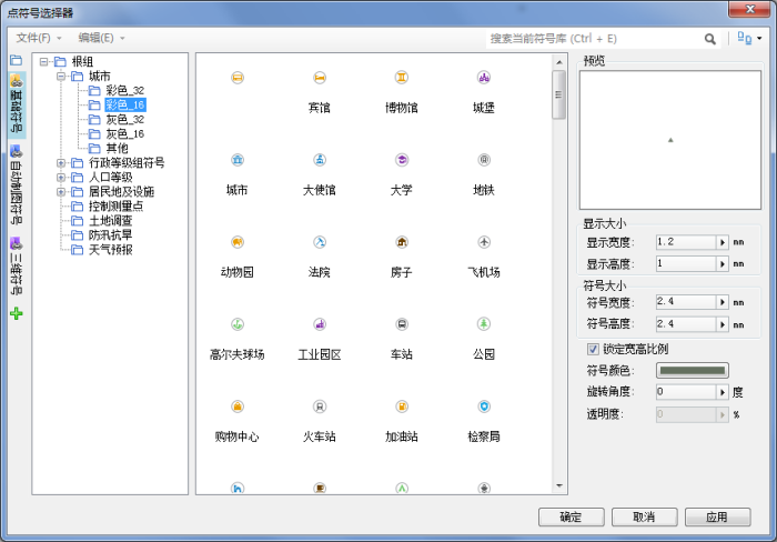 |
| Figure: Vector Symbol Schematic |
The color design of Raster Symbol is not absolute, but it should not be too unconventional, and it should be in line with the public's understanding of the color of the object. For example, locations representing government units are generally indicated in red, and it is not appropriate to set them to green or black.
The size and color of the Raster Symbol needs to match the overall color of the map. When you are not sure which color should be set for various objects, you can set the main color of Raster Symbol to the same color, such as gray (S = 0 in HSB).
The Raster Symbol used in SuperMap iDesktop needs to be made by using drawing software such as photoshop, and then imported into the symbol library for use. This requires that the color of the symbol should be determined when making the Raster Symbol. Save the trouble of remaking the Color because it doesn't match the map effect. It should be noted that Raster Symbols generally have a circular background, and the background color is generally white, which contrasts with the main color. In addition, in Digital Map, the dotted symbol is usually followed by a note, so if there is no image symbol, the physical object referred to by the dotted symbol can also be identified by the note, which is one of the reasons why we can boldly set the dotted symbol as the default symbol.
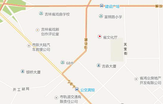 |
| Figure: The application of symbols in maps |
Related content
The Basic Characteristics of Color and Color Psychology