


The surface area is large, which can quickly catch the reader's vision and affect the reader's aesthetic interest. The successful use of region color is to use less map language to convey more abundant geographic information, so that the map use and design intent can be clearly, completely and accurately expressed. Therefore, the color of the region should be differentiated and different color values should be selected.
Different face regions express different properties in the map. The color design of the face area should be different from other symbols according to its nature. Vegetation, waters, and neighborhoods (or settlements) are common surface areas. In general, green vegetation is used and blue water is used. The block can choose different colors according to the use of the map. For example, the color of the block in the topographic map is gray (K = 20), and the block in the administrative map can select different color systems and color values according to its ownership. Use light pink (M = 25), light yellow (Y = 30), light orange (M = 15, Y = 30), light purple (C = 22, M = 28) or light green (C = 15, Y = 20) to represent blocks belonging to different administrative divisions.
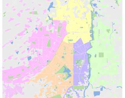 |
| Figure: Design of different blocks with different colors |
When the face area and other layers are displayed in superposition, there will be a phenomenon of occlusion. In the actual map production, we can also set the color transparency to achieve the translucent effect of display, especially when superimposed with Image Data. After turning on "Alpha Channel" in "Map Properties", when setting the color of the face area under RGB, set the (Alpha) value to achieve the semi-Transparent Display effect of the color value. A value range: 0-100, 0: indicates full transparency, 100: indicates opacity.
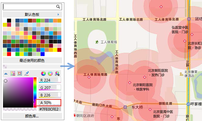 |
| Figure: Setting map transparency by A value |
 Related content:
 The Basic Characteristics of Color and Color Psychology