SuperMap iDesktop supports multiple types of diagrams including: column, pie, line, bubble, combo, scatter, time series, histogram, bar, donut, and area diagrams.
The following content details each diagram and its use.
Column Chart
A column chart presents data distributions using a series of vertically or horizontally different rectangles with lengths or heights.
The greatest advantage of column charts is the sizes of different data can be shown up intuitively which makes it easier to compare differences between data.
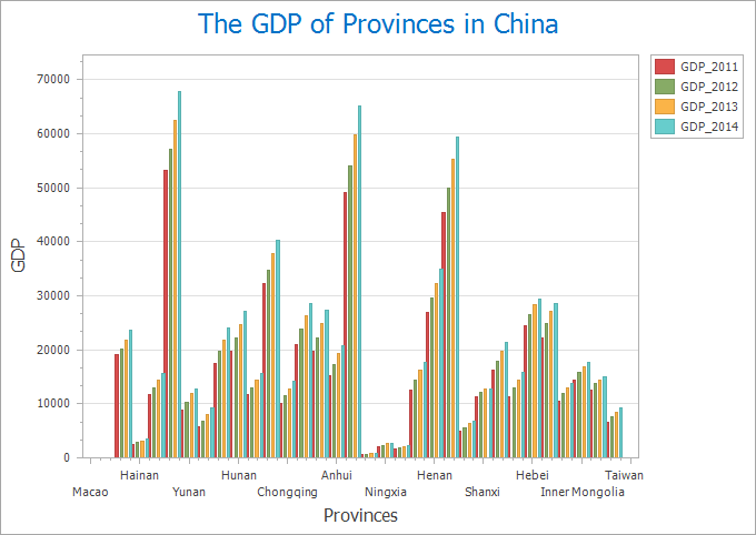 |
| Figure 1: Column Diagram |
Pie Chart
A pie chart is a circular statistics graphic which is divided into one or more slices to illustrate numerical proportion and ratio.
A pie chart is often used to represent the proportion of a part to the quantity. Such as: the proportion of a goods to the total goods in turnover of a supermarket.
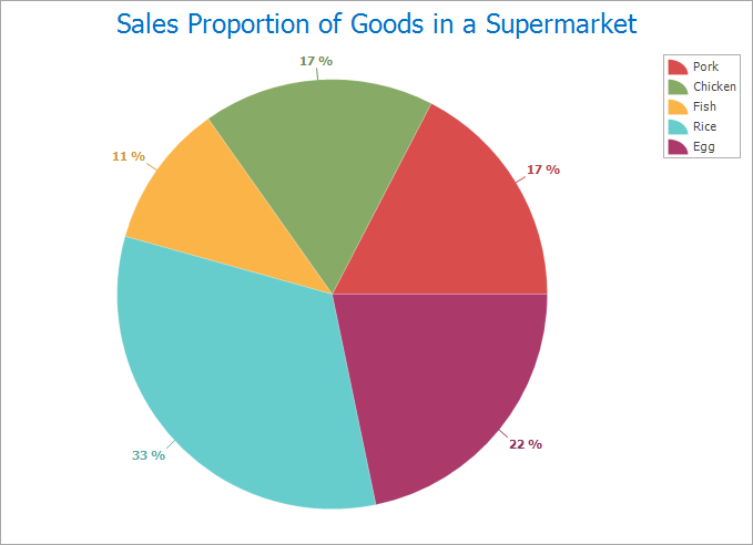 |
| Figure 2: Pie chart |
Line Chart
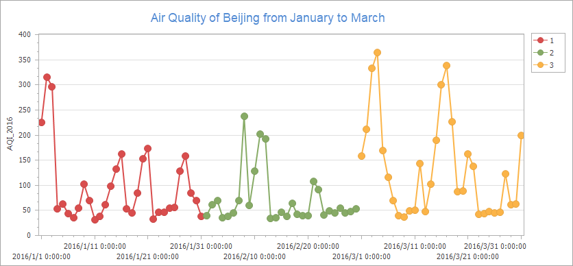
Line charts represent changes of statistics quantity. A line chart can not only show the quantity but also reflect the changes of the same thing at different times.
The advantage of line chart is to display the changing trends of data. The following line chart shows the air quality of Beijing from 2014 to 2017.
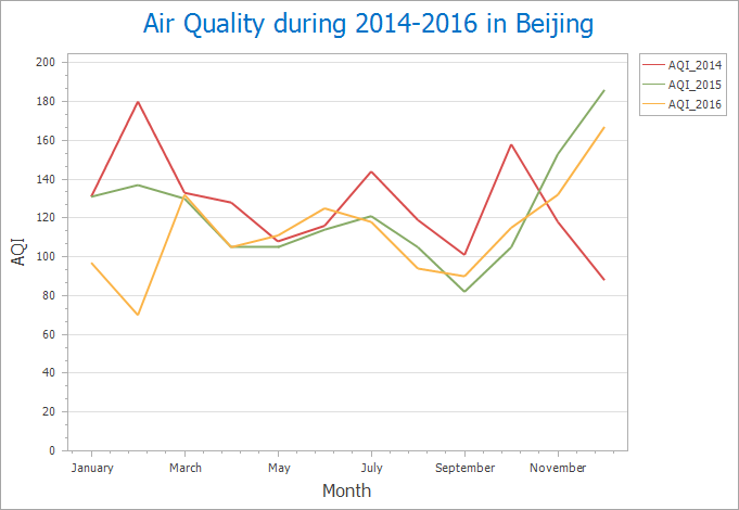 |
| Figure 3: Line Chart |
Bubble Chart
A bubble chart is a variation of a XY scatter plot. In a bubble chart, specify the location of a bubble through x-axis and y-axis and its size through the third variable.
Bubble charts are often used to view the relationships between categorical data. Such as the relationship between avian influenza events and population in some district.
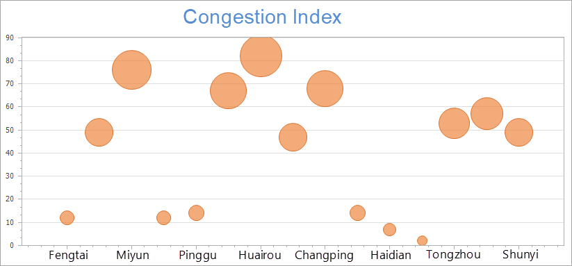 |
| Figure 4: Bubble chart |
Combo Diagram
A combo diagram consists of two or more different graphs. A combo diagram could be the combination of two column charts, two line charts or a column chart and a line chart. To make a combo diagram, at least two different datasets with commonly used string fields are necessary.
Combo diagrams can interpret questions about data. Such as: The relationships between GDP and population for each province in China in 2014.
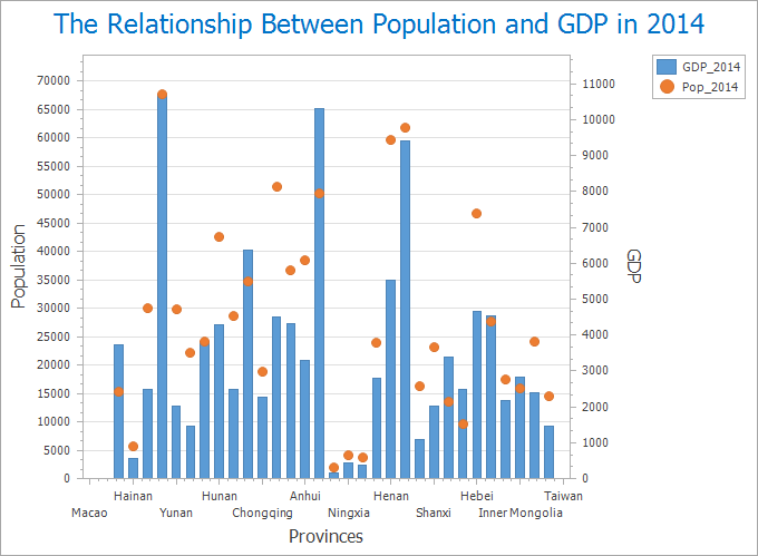 |
| Figure 5: Combo Diagram |
Scatter Plot
Scatter plots take two variables as x, y coordinates display the trend of data and relationships between values.
Scatter plots apply to represent relationships, distribution modes between two variables and exception values found based on distribution modes. Such as the relationships between the number of leaks and total length of pipelines.
Histogram
A histogram is a frequency distribution map deviding values into each bar or interval. The height of a bar represents the frequency of items fell into the bar.
Histograms is one kind of intuitive graph type to facilitate the display of differences of frequencies between each group. Such as: The distributions of qualities of products from a factory.
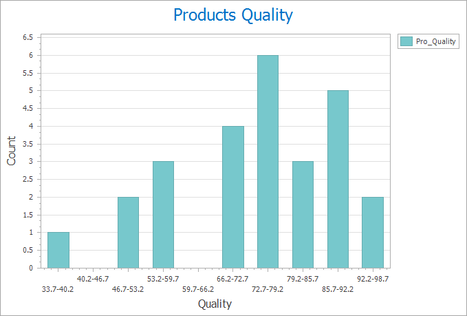 |
| Figure 6: Histogram |
Bar Chart
In a bar chart, lengths of bars represent quantities, according to numerical values of catogories to generate different bars. Bar charts are mainly used to summarize and compare classification data.
With a bar chart, the relative differences between catogories of numerical data can be shown intuitively. Such as: comparing the GDP of provinces during 2012-2014 in China.
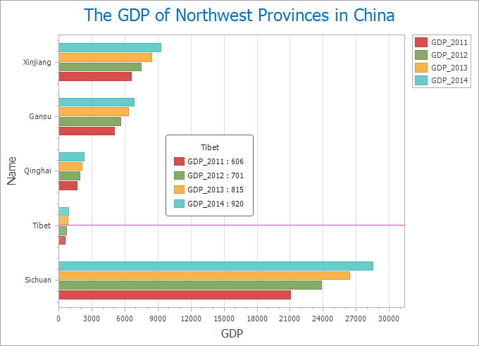 |
| Figure 7: Bar chart |
Area Graph
Area graphs emphasize the speed that quantities change over time, also can be used to draw attention to trends in total value.
When there are sum relationships in categories of data, an area chart can be used for showing the relationships visually. Such as the relationships between cost and income.
 |
| Figure 8: Area Graph |
Donut Chart
Similar to pie charts, donut charts aim to the relationships between a whole and parts.
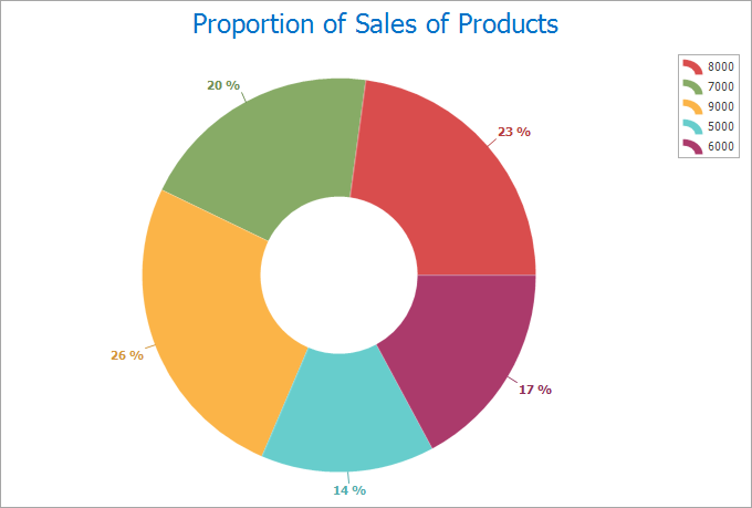 |
| Figure 9: Donut Chart |
Time Series Chart
The horizontal axis of the time seriers chart is used for plotting increments of time and the vertical axis represent values of the variable that is being measured.
 |
| Figure 10: Time Series Chart |
 Related topics
 Conversion between diagrams and thematic maps