DataInsights supports visualizing spatial data on map, creating thematic maps, creating charts by one-click and supports mouse drag operations. Maps include Classic, Unique, Range, Symbol Size and Heatmap; charts include Histogram, Bar chat, Bar graph, Pie chart, Line chart, Tree chart, Radar chart, Word cloud, Scatter chart, Box chart, Heat chart and Relation graph. Text view and Image view are also supported.
Views can be repositioned and reordered by dragging and dropping, and each view size can be adjusted by dragging in eight directions. The added views can be downloaded as PNG individually, while the entire workbench can be exported as PNG or PDF. Additionally, multiple maps and charts created based on the same data are linked by default; all map views support view synchronously based on the center point.
Create maps
Three ways are supported for creating maps:
- On the Workbench page, move the mouse cursor
over the field with which you want to create a map, and select
 icon
to create.
icon
to create. - In the upper navigation bar, select "Add Views > Map >Create from data", select the field which you want to create a map, click the "OK" button to create.
- In the upper navigation bar, select "Add Views > Map > Choose from my map". You can choose a map from the "My Maps" list, then click the "OK" button to create.
Note 1: The map views can be created when the projection of the added data is EPSG Code: 4326, EPSG Code: 3857, EPSG Code:4490, or Baidu coordinates.
Note 2: Maps with projections EPSG Code: 4326, EPSG Code: 3857, and EPSG Code:4490 can be added to the "My Maps" list.
Toolbar and Map Controls
The selected Map View will display the title and a toolbar with "Lower", "Export", "Clear Highlight", "Maximize/Return", and "close" buttons. The specific functions are as follows:
- Lower
 :
Place the map view at the bottom, and you can overlap other views
onto it.
:
Place the map view at the bottom, and you can overlap other views
onto it. - Export
 : Export the current
map view as a PNG image to local.
: Export the current
map view as a PNG image to local. - Clear Highlight
 : If you
have selected data in the map, you can clear the selection by clicking
this button.
: If you
have selected data in the map, you can clear the selection by clicking
this button. - Maximize/Return
 : Zoom in/zoom
out the map view.
: Zoom in/zoom
out the map view. - Close
 : Delete the map
view.
: Delete the map
view.
The left side of the map view lists controls, including zoom in, zoom out, reset bearing, maximize, and measure controls. The specific functions are as follows:
- Zoom In
 :
Click to enlarge the map twofold, or use the mouse wheel to zoom in.
:
Click to enlarge the map twofold, or use the mouse wheel to zoom in. - Zoom Out
 :
Click to shrink the map twofold, or use the mouse wheel to zoom out.
:
Click to shrink the map twofold, or use the mouse wheel to zoom out. - Reset Bearing to North
 :
Reset the orientation of the map view after pitching or rotating the
map.
:
Reset the orientation of the map view after pitching or rotating the
map. - Maximize
 :
Display the map view in full width.
:
Display the map view in full width. - Measure
 :
Supports distance and area measurement.
:
Supports distance and area measurement.
Additionally, DataInsights provides ![]() in the right-hand panel of the editor to display the layers in the current
map, and you can create different thematic maps based on each layer;
in the right-hand panel of the editor to display the layers in the current
map, and you can create different thematic maps based on each layer; ![]() , with analysis functions for data added
to the map, see: Performing analysis;
, with analysis functions for data added
to the map, see: Performing analysis; ![]() , to modify the map view title, add remarks,
and change the basemap. Map views created by default will use the default
basemap set in the toolbar
, to modify the map view title, add remarks,
and change the basemap. Map views created by default will use the default
basemap set in the toolbar ![]() "Settings
> Map > Basemap". The detailed operations of
"Settings
> Map > Basemap". The detailed operations of ![]() are as follows:
are as follows:
- Adding a layer: supports adding data to the map. You can drag a data field from the Data panel on the left to the map view to add layers. Added layers will create thematic maps with the dragged data fields by default, and you can expand this layer on the right to adjust the thematic style.
- Adjusting the order of layers: you can adjust the order of layers by dragging them up and down.
- Remove layers: you can remove any layer except the basemap.
- Show/Hide layers: show or hide any layer except the basemap.
Types of thematic maps
Classic
Set a global style for all features in the layer based on the selected data field. The point feature layer supports setting the color of the point symbol; the line feature layer supports setting the line style and color; the polygon feature layer supports setting the fill color.
Unique
Set a unique rendering style for each class of features with the same thematic value based on the selected data field, and you can distinguish features of different thematic values by their color.
Range
Range thematic maps require the selected field to be of the numeric type. In a range thematic map, the thematic values are divided into different segments according to the segment method. The features are assigned to one of the segments according to their thematic values and use the same style within the same range segment. A criterion for good segmentation is whether features with similar values are in the same segment. Two important factors determine the presence of a range thematic map: the segment method and the number of segments. The DataInsights supports the following segment methods:
- Offset Segment: Segment equally based on the maximum value, the minimum value of all thematic values and the number of segments specified. In Offset Segment, each segment length is equal.
- Natural Breaks: Segment based on the natural groupings within the data. The difference within the same range segment is the smallest, and the difference between different range segments is the largest. This segment method is based on Jenks Natural Breaks algorithm.
- Square Root Segment: Segment equally based the square root of the thematic value determined by the thematic field.It is suitable for the following situations:
- There are no negative numbers in the data.
- There are large differences between the maximum and minimum values of thematic values.
- The results are unsatisfactory when using Offset Segment.
- Logarithm Segment: Calculate the logarithm of the thematic values determined by the thematic field, then use Offset Segment based on it.It is suitable for the following situations:
- There are no negative numbers in the data.
- There are large differences between the maximum and minimum values of thematic values.
- The results are unsatisfactory when using Offset Segment and Square Root Segment.
Symbol Size
Symbol Size thematic map is similar to the range thematic map, except that each segment is represented by a dot symbol of a different size. DataInsights supports setting minimum radius, maximum radius, and fill color of the dot symbol. Only point features support this thematic map.
Heatmap
Heatmap shows the distribution of two-dimensional discrete data by color, and it can present the trend of decay of the weight value of each discrete point and the superposition of decay between discrete points. Heatmap needs to set the weight field, hotspot radius (in pixels), and color. Only point features support this thematic map.
Create charts
Similar to maps, creating charts supports two ways:
- On the Workbench page, move the mouse cursor
over the field with which you want to create a chart, and select icon
 to create a chart.
- In the upper navigation bar, select "Add Views >Chart", select the field with which you want to create a chart, click the "OK" button to create.
Toolbar
The selected Chart View will display the title and a toolbar with "Export", "Clear Highlight", "Maximize/Return", and "Close" buttons. The specific functions are as follows.
- Title: The selected chart view will show the
title which can be changed in the right-hand panel by clicking on
the button
 , you can also
add a remark to the chart view.
, you can also
add a remark to the chart view. - Export: Export the current
chart view as a PNG image to local.
- Clear Highlight: If you
have selected data in the chart, you can clear the selection by clicking
this button.
- Maximize/Return: Zoom in/zoom
out the chart view.
- Close: Delete the chart
view.
Additionally, DataInsights provides ![]() for switching chart types, setting chart parameters and styles;
for switching chart types, setting chart parameters and styles; ![]() ,
for filtering the range of data in the chart; and
,
for filtering the range of data in the chart; and ![]() ,
for modifying the chart basic information. The following are introductions
of chart type:
,
for modifying the chart basic information. The following are introductions
of chart type:
Types of Chart
The Histogram is the default chart type in DataInsights, and you can change the chart type to suit your business needs. To do this, click on the current chart view, click on "Chart" > "Type" in the panel on the right, then click on the chart type you want to switch to in the drop-down list. DataInsights supports creating Histogram, Bar Chart, Bar Graph, Pie Chart, Line Chart, Tree Chart, Radar Chart, Word Cloud, Scatter Chart, Box Chart, Heat Chart, and Relation Graph.
Histogram
The histogram uses a series of bars of varying height to indicate the data distribution.It supports changing parameters, changing styles, and filtering the range of data displayed in the chart.
Parameters
- X Field: the data field displayed on the X-axis.
- X Statistic method: including Times, Sum, Maximum, Minimum, Average, and Median.
- Segment method: including Offset Segment, Natural Segment, Square Root Segment, and Logarithm Segment.
- Number: the number of segments.The range is [2,15].
- Y Sorting method: including Unsorted, Ascending, and Descending.
Styles
Click on "Chart" > "Style" on the right-hand panel to set the style of the histogram.
- Legend: Show or hide the legend of the histogram.
- Background: the background color of the histogram.
- Label Color: the text color of the histogram.
- Label Size: the size of X- and Y-axis text.
- Data Color: the color of bars.
- Restore default: Restore to the default style settings.
Filter
Click on the "Filter" on the right-hand panel to select the range of data to be displayed on the X-axis.
Bar Chart
The bar chart uses the height of the bar as a variable to indicate the data distribution.It supports changing parameters, changing styles, and filtering the range of data displayed in the chart.
Parameters
- X Field: the data field displayed on the X-axis.
- Y Field: the data fields displayed on the Y-axis.
- Y Statistic method: including Times, Sum, Maximum, Minimum, Average, and Median.
- Y Sorting method: including Unsorted, Ascending, and Descending.
Styles
- Click on "Chart" > "Style" on the right-hand panel to set the style of the bar chart.
- Legend: Show or hide the legend of the bar chart.
- Background: the background color of the bar chart.
- Label Color: the text color of the bar chart.
- Label Size: the size of X- and Y-axis text.
- Data Color: the color of bars.
- Restore default: Restore to the default style settings.
Filter
Click on the "Filter" on the right-hand panel to select the range of data to be displayed on the X-axis.
Bar Graph
The bar graph uses the length of the bar as a variable to indicate the data distribution.It supports changing parameters, changing styles, and filtering the range of data displayed in the chart.
Parameters
- X Field: the data fields displayed on the X-axis.
- Y Field: the data field displayed on the Y-axis.
- X Statistic method: including Times, Sum, Maximum, Minimum, Average, and Median.
- X Sorting method: including Unsorted, Ascending, and Descending.
Styles
Click on "Chart" > "Style" on the right-hand panel to set the style of the bar graph.
- Legend: Show or hide the legend of the bar graph.
- Background: the background color of the bar graph.
- Label Color: the text color of the bar graph.
- Label Size: the size of X- and Y-axis text.
- Data Color: the color of bars.
- Restore default: Restore to the default style settings.
Filter
Click on the "Filter" on the right-hand panel to select the range of data to be displayed on the Y-axis.
Pie Chart
The pie chart shows the proportion of data in the total by dividing the size of the sector.It supports changing parameters, changing styles, and filtering the range of data displayed in the chart.
Parameters
- Attribute: the data category field to be counted.
- Indicators: the data value field to be counted(numeric type).
- Statistic method: including Times, Sum, Maximum, Minimum, Average, and Median.
Styles
Click on "Chart" > "Style" on the right-hand panel to set the style of the pie chart.
- Legend: Show or hide the legend of the pie chart.
- Background: the background color of the pie chart.
- Label Color: the text color of the pie chart.
- Label Size: the size of text.
- Data Color: the color of sectors.
- Restore default: Restore to the default style settings.
Filter
Click on the "Filter" on the right-hand panel to select the range of data to be displayed in the pie chart.
Line Chart
The line chart displays the distribution and trend of data by connecting the data points with line segments.It supports changing parameters, changing styles, and filtering the range of data displayed in the chart.
Parameters
- X Field: the data field displayed on the X-axis.
- Y Field: the data fields displayed on the Y-axis.
- Y Statistic method: including Times, Sum, Maximum, Minimum, Average, and Median.
- Y Sorting method: including Unsorted, Ascending, and Descending.
Styles
Click on "Chart" > "Style" on the right-hand panel to set the style of the line chart.
- Legend: Show or hide the legend of the line chart.
- Background: the background color of the line chart.
- Label Color: the text color of the line chart.
- Label Size: the size of X- and Y-axis text.
- Data Color: the color of lines.
- Restore default: Restore to the default style settings.
Filter
Click on the "Filter" on the right-hand panel to select the range of data to be displayed on the X-axis.
Tree chart
The tree chart shows the proportion of data categories by the size of the rectangle. It distinguishes the different categories by color and is suitable for presenting data from multiple categories.It supports changing parameters, changing styles, and filtering the range of data displayed in the chart.
Parameters
- Attribute: the data category field.
- Indicators: the category weight field(numeric type).
- Statistic method: including Times, Sum, Maximum, Minimum, Average, and Median.
Styles
Click on "Chart" > "Style" on the right-hand panel to set the style of the tree chart.
- Legend: Show or hide the legend of the tree chart.
- Background: the background color of the tree chart.
- Label Color: the text color of the tree chart.
- Label Size: the size of text.
- Data Color: the color of rectangles.
- Restore default: Restore to the default style settings.
Filter
Click on the "Filter" on the right-hand panel to select the range of data to be displayed in the tree chart.
Radar chart
The radar chart displays multivariate data in the form of two-dimensional charts of three or more variables displayed on axes starting at the same point, where the relative positions and angles of the axes are usually meaningless.It supports changing parameters, changing styles, and filtering the range of data displayed in the chart.
Parameters
- Attribute: the data category field.
- Indicators: the variable fields which should be numeric type.
- Statistic method: including Times, Sum, Maximum, Minimum, Average, and Median.
Styles
Click on "Chart" > "Style" on the right-hand panel to set the style of the radar chart.
- Legend: Show or hide the legend of the radar chart.
- Background: the background color of the radar chart.
- Label Color: the text color of the radar chart.
- Label Size: the size of text.
- Data Color: the color of radar shapes.
- Restore default: Restore to the default style settings.
Filter
Click on the "Filter" on the right-hand panel to select the range of data to be displayed in the radar chart.
Word Cloud
The word cloud is a visual description of a keyword, which visually represents its frequency of occurrence by the size of the keyword.It supports changing parameters, changing styles, and filtering the range of data displayed in the chart.
Parameters
- Attribute: the keyword field to be counted.
- Statistic method: including Count.
Styles
Click on "Chart" > "Style" on the right-hand panel to set the style of the word cloud.
- Background: the background color of the word cloud.
- Data Color: the color of keywords.
- Restore default: Restore to the default style settings.
Filter
Click on the "Filter" on the right-hand panel to select the range of data to be displayed in the word cloud.
Scatter Chart
The scatter chart indicates the approximate trend in the change of the dependent variable with the independent variable, based on which a suitable function can be selected to fit the data points. It shows the interrelationship, distribution, or trend between the two variables by the points formed by the data.It supports changing parameters, changing styles, and filtering the range of data displayed in the chart.
Parameters
- X Field: the data field displayed on the X-axis.
- Y Field: the data field displayed on the Y-axis.
- Group: the group field.When comparing aggregated data across categories, you can set the grouping fields so that data from different categories will be displayed in different colors.
Styles
Click on "Chart" > "Style" on the right-hand panel to set the style of the scatter chart.
- Legend: Show or hide the legend of the scatter chart.
- Background: the background color of the scatter chart.
- Label Color: the text color of the scatter chart.
- Label Size: the size of text.
- Data Color: the color of scattered points.
- Restore default: Restore to the default style settings.
Filter
Click on the "Filter" on the right-hand panel to select the range of data to be displayed in the box chart.
Box Chart
The box chart displays the maximum, minimum, median, upper, and lower quartiles of a set of data as a box, while isolated points not in the box are outliers.It supports changing parameters, changing styles, and filtering the range of data displayed in the chart.
Parameters
- X Field: the data field displayed on the X-axis.
- Y Field: the data field displayed on the Y-axis.
Styles
Click on "Chart" > "Style" on the right-hand panel to set the style of the box chart.
- Legend: Show or hide the legend of the box chart.
- Background: the background color of the box chart.
- Label Color: the text color of the box chart.
- Label Size: the size of text.
- Data Color: the color of boxes and points.
- Restore default: Restore to the default style settings.
Filter
Click on the "Filter" on the right-hand panel to select the range of data to be displayed on the X-axis.
Heat Chart
The heat chart correlates two variables to show hot spots, cold spots, and specific indicators. The heat chart can display the data distribution visually.It supports changing parameters, changing styles, and filtering the range of data displayed in the chart.
Parameter
- X Field: the data field displayed on the X-axis.
- Y Field: the data field displayed on the Y-axis.
- Attribute: the statistic indicator field.
- Statistic method: including Times, Sum, Maximum, Minimum, Average, and Median.
Styles
Click on "Chart" > "Style" on the right-hand panel to set the style of the heat chart.
- Legend: Show or hide the legend of the heat chart.
- Background: the background color of the heat chart.
- Label Color: the text color of the heat chart.
- Label Size: the size of text.
- Data Color: the color of values.
- Restore default: Restore to the default style settings.
Relation Graph
The relation graph shows the degree of association between data.It supports changing parameters, changing styles, and filtering the range of data displayed in the chart.
Parameter
- X Field: the data field displayed on the X-axis.
- Y Field: the data field displayed on the Y-axis.
- Attribute: the statistic indicator field.
- Statistic method: including Times, Sum, Maximum, Minimum, Average, and Median.
Styles
Click on "Chart" > "Style" on the right-hand panel to set the style of the relation graph.
- Legend: Show or hide the legend of the relation graph.
- Background: the background color of the relation graph.
- Label Color: the text color of the relation graph.
- Label Size: the size of text.
- Data Color: the color of data.
- Restore default: Restore to the default style settings.
Filter
Click on the "Filter" on the right-hand panel to select the range of data to be displayed on the X- and Y-axis.
Create texts
In the upper navigation bar, select "Add Views >Text" to create a text view for adding a title or description for your insight item. The text view provides a toolbar with "Export" (export the current text view as a PNG file), "Maximize", and "Close" buttons. The right-hand panel supports setting the view title and text styles including background color, font, font size, alignment, etc.
Create images
In the upper navigation bar, select "Add Views >Image" to create an image view, then upload local picture to the image view to create a richer visual insight project or use it as an auxiliary display for analysis reports. The image view provides a toolbar with "Export" (export the current image view as a PNG file), "Maximize", and "Close" buttons. The right-hand panel supports setting the view title and re-uploading the image.
View linkage and sync maps range
View linkage is offered for discovering the association
between spatial data and attribute data. Only the maps and charts created
based on the same data can be displayed in association. Linkage display
is opened by default. You can open/close in the View Setting ![]() at the upper right bar.
at the upper right bar.
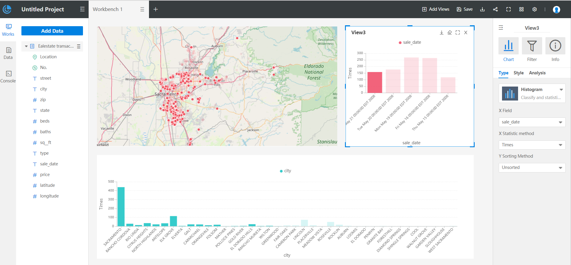
Specific operation: Select the data displayed on map or chart, the associated data on other map or chart will be highlighted. As shown in the figure below, on the right histogram click the first column, ie., the date is "May 21 00:00:00 EDT 2008", then all the house properties sold on this day are filtered and highlighted on the left map, and you can also have a glance at which cities in CA state have transactions on this day. To clear the highlights, select any of linkage views, click "Clear Highlight" on the upper right of the view. After clearing, you can re-select the linkage data.
Additionally, DataInsights supports sync maps range, which means when browsing a map view, other map views will automatically move or zoom in and out in sync based on the same center point. Sync maps range is not enabled by default, and you can turn it on by clicking on 'View settings > Sync maps range' in the top right toolbar.