


A statistical thematic map is created based on statistical data contained in map properties tables, which visually reflects the relationships among the same type of property fields on the map. Through statistical thematic maps, users can better analyze the distribution characteristics and development trends of natural phenomena and socio-economic phenomena, such as vegetation type distribution changes in research areas or urban population growth rates.
In , statistical thematic maps can display information from multiple field attributes simultaneously, enabling horizontal and vertical comparisons within or between regions. Moreover, it is the only thematic map type that supports selecting multiple thematic variables, allowing analysis of multiple numerical variables at once.
In the "Thematic Map" tab under the "Statistics" group, click the "Statistics" drop-down button. Available statistical thematic map types include bar chart, pie chart, ring chart, point chart, rose chart, area chart, line chart, step chart, stacked bar, 3D bar, 3D pie, 3D rose, and 3D stacked bar. Users can select appropriate types according to different requirements to create various statistical thematic maps.
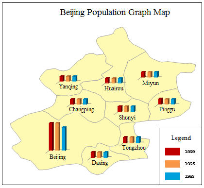
Predefined statistical thematic map templates include: Population Density Comparison Bar Chart, Urban-Rural Construction Land Scale Comparison 3D Pie, Age Structure Population Comparison 3D Rose, Primary Industry Production Growth 3D Bar. Users can also customize statistical thematic maps through the style settings window. The following diagram shows a statistical thematic map using cylindrical bars to express provincial urban/rural per capita income and local income levels. Unlike traditional bar charts, this example employs circular columns with subtle color gradients for 3D effects. For specific creation methods, refer to Sample Map -> Population and Economy Thematic Map.
 |
Detailed descriptions of eleven statistical thematic map types are as follows:
| Name | Illustration | Features and Scope of Application |
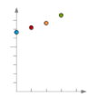
| Line Chart |
|
Displays data changes over time, suitable for showing trends at equal time intervals. Recommended when property fields represent time-based numerical values (e.g., years, months) requiring trend visualization. Property field names are distributed along the X-axis, while attribute values are evenly distributed along the Y-axis. |
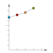
| Point Chart |
|
Illustrates dependent variable trends relative to independent variables by displaying attribute values as points. Ideal for analyzing multiple property fields, where more data points enhance comparison effectiveness. Property field names are distributed along the X-axis, with attribute values along the Y-axis. |
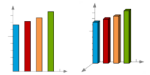
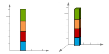
| Bar Chart and 3D Bar |
|
Compares property fields within a specific period using rectangular lengths to represent attribute values. Property field names are distributed along the X-axis, values along the Y-axis. 3D Bars use three-dimensional axes and perspective effects, though the third axis holds no actual meaning. |
| Stacked Bar and 3D Stacked Bar |
|
Demonstrates relationships between individual property fields and totals, comparing each value's proportion to the whole. Recommended when emphasizing total values across multiple fields. Property field values are stacked along the Y-axis, with the X-axis being nominal. 3D versions use dimensional effects without meaningful third axes. |
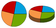
| Pie Chart and 3D Pie |
|
Shows attribute value distributions and percentages relative to totals. Fixed radius with sector angles varying according to each property field's proportion. |
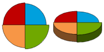
| Rose Chart and 3D Rose |
|
Compares field values at equal time intervals. Unlike pie charts, rose charts maintain fixed sector angles while radii vary with value proportions. |
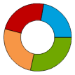
| Ring Chart |
|
Displays part-to-whole relationships, where each ring segment represents a property field's percentage contribution to the 100% total. |
Statistical thematic maps can be created from any point, line, or polygon vector layer. To create one, first set the target vector layer as current in the layer manager, then generate the thematic map accordingly.
Note: Statistical graphic sizes depend on corresponding expression field values, which may result in varying graphic sizes for objects with identical field values.
Two Approaches to Create Statistical Thematic Maps:
 Create New Statistical Thematic Map
Modify Statistical Thematic Map