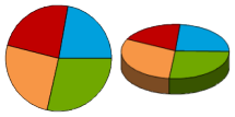
Statistical Thematic Map is to draw according to the Statistical Data contained in the Map Properties table, which can vividly reflect the relationship between the same type of Property Fields in the map. With the help of Statistical Thematic Map, we can better analyze the distribution characteristics and development trends of natural and socio-economic phenomena, such as the distribution changes of vegetation types or the growth rate of urban population in the study area.
In , Statistical Thematic Map can represent information for multiple field properties simultaneously, creating horizontal and vertical comparisons within and between zones. In addition, Statistical Thematic Map the only Thematic Map that can select multiple Thematic Variables and allow multiple numeric variables to be analyzed at one time.
On the Thematic Map tab, in the Statistics group, click the Statistics Drop-down Button. User-selectable Statistical Thematic Map types include column chart, pie chart, ring chart, dot chart, rose chart, area chart, line chart, ladder chart, Stacked Bar, 3D Bar Chart, 3D Pie Chart, With 3D Rose Chart and 3D Stacked Bar Chart, users can select appropriate Statistical Thematic Map types and create different Statistical Thematic Map according to different needs.
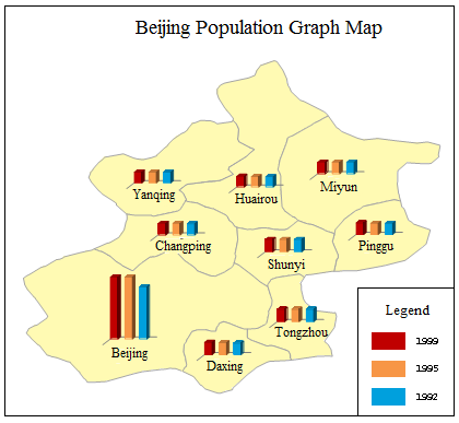
The optional Graph Map Templates include: comparative histogram of population density, comparative 3D Pie Chart of urban and rural construction land scale, comparative 3D Rose Chart of age-structure population, and 3D Bar Chart of production increment of primary industry; Users can also set various parameters of the thematic map through the Style Settings window of the Statistical Thematic Map. User-defined Create a graph thematic map The figure below is a schematic diagram of the Statistical Thematic Map, in which the urban per capita income, rural per capita income and local income level of each province are expressed in the form of a histogram. It also uses a slight color gradient to create a three-dimensional effect. Please refer to Sample Map- & gt; Population and Economy Thematic Map。
 |
The following is a detailed description of the eleven Statistical Thematic Map types:
| Name | Illustration | Features and Scope of application. |
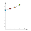
| Line chart |
| Line charts are used to represent data over time and are useful for showing trends in data at equal time intervals. It is recommended to select the broken line chart if the Property Field represents the value evenly distributed by time (such as year, month, etc.) and needs to show the change trend. In the broken line chart, the Property Field names constituting the thematic map are distributed along the abscissa, and the attribute values are uniformly distributed along the ordinate. |
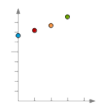
| Dot Plot |
| The dot plot is used to show the trend of the dependent variable with the change of the independent variable, that is, to compare the numerical values and display the attribute values in the form of dots in the statistical chart. When there are many Property Fields to be analyzed, it is recommended to use the dot plot. The distribution effect will be obvious. The more data contained in the dot plot, the better the comparison effect will be. In the point map, the Property Field names constituting the thematic map are distributed along the abscissa, and the attribute values are uniformly distributed along the ordinate. |
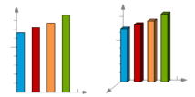
| Bar Chart and 3D Bar Chart |
| The histogram is used to represent the comparison between the Property Fields in a certain time, and the length of the rectangle is used to express the size of the property value. In the histogram, the Property Field names constituting the thematic map are distributed along the abscissa, and the attribute values are uniformly distributed along the ordinate. 3D Bar Chart is displayed with three-dimensional coordinate axis and three-dimensional perspective effect, but it is not a real three-dimensional chart, and the third coordinate axis has no practical significance. |
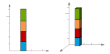
| Stacked Bar and 3D Stacked Bar Chart. |
| Stacked Bar is used to represent the relationship of a single Property Field to a population and to compare the contribution of each value to the population. Stacked Bar is recommended when comparing multiple Property Fields and you want to emphasize the total value. In the Stacked Bar, the Property Field values that constitute the thematic map are stacked along the ordinate, and the abscissa has no practical significance. 3D Stacked Bar Chart is displayed with 3D coordinate axis and 3D perspective effect, but it is not a real 3D map, and the third coordinate axis has no practical significance. |
| Pie Chart and 3D Pie Chart |
| Pie charts are used to represent the distribution of property values among Property Fields in relation to the total value and the percentage of each Property Field. The pie chart represents the size of the total amount, that is, the radius of each sector is fixed, and its central angle will change according to the proportion of the Property Field in the total amount. |
| Rose Chart and 3D Rose Chart |
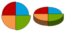
| The rose chart is used to show the comparison of the field values of each Property Field in the same time interval. Both the rose chart and the pie chart can be used to compare the size of each Property Field value. Unlike the pie chart, the center angle of the sector represented by the Property Field in the rose chart is fixed, and the radius of each sector will change according to the proportion of each Property Field value in the total. |
| Ring Chart |
| The ring chart is used to represent the relationship between each part and the whole. Each part of the ring chart represents a Property Field, and the proportion of each Property Field in the ring can be clearly seen. The total ring is 100%. |
The Statistical Thematic Map can be made based on any point, line or surface Vector Layer. When making a Statistical Thematic Map, first set the Vector Layer Settings to be Create Thematic Map as the current layer, that is, select the Vector Layer in the Layer Manager. You can then Create a graph thematic map
based on that layer.It should be noted that when making a statistical chart, the size of the statistical chart of a single object is determined by the expression field value corresponding to the object. Therefore, in the display of the thematic map, different objects may have the same field value, but the size of the statistical chart is different.
There are two ways tomake Statistical Thematic Map:
 Create a new Statistical Thematic Map.
 Modify Statistical Thematic Map.


