


Data visualization is ubiquitous, and with the increasing capacity and complexity of urban, traffic, meteorological and other data, the demand for big data visualization is growing, which has become a new way for human beings to read and understand information. In the field of GIS, data analysis by means of large data visualization can realize the mining of information from dense and intricate data, and then display it by visualization, so that readers can see the spatial distribution pattern, trend, correlation and Statistic Infomation of data at a glance. Which may be difficult to detect in other presentations.
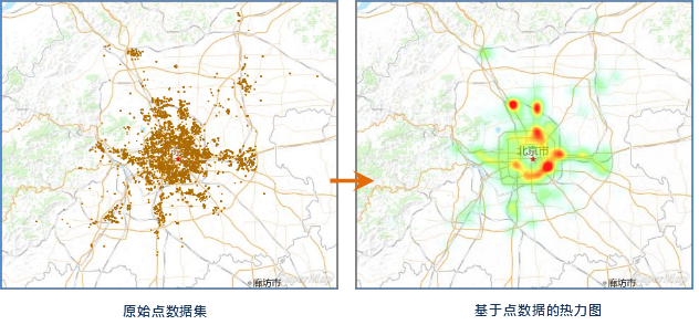
Big data visualization can be done in real time, and Analyst Result can be updated in real time according to the change of Map Scale. At present, Application provides a convenient data visualization function, which can make a thermodynamic diagram or Grid Aggregation Map with one key for point data.
Executive summary:

Thermodynamic map is to help people quickly extract valuable information from massive data through various degrees of information of ribbon rendering data, such as the level of expression temperature, the density of expression density or the frequency of access, and to display it intuitively by means of visualization. Therefore, thermodynamic map is one of the means of large data visualization.
 |
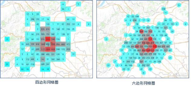
The Grid Aggregation Map uses the spatial aggregation method to represent the distribution and statistical characteristics of Spatial Data. SuperMap provides two shapes of meshes for Aggregation Display, one is a rectangular mesh, and the other is a Hexagonal Mesh.
 |