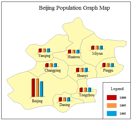
The graph map draws charts for each element or record to reflect the corresponding thematic value. Unlike other thematic maps, the Graph maps have their own unique features. Graph maps are usually used to show demographic information, for example, GDP, Crop product, and population of each state. More than one thematic variable can be displayed in each graph. You can also compare these thematic variables across the entire map.
Graph maps employ more than one fields so that the graph result can be analyzed horizontally and vertically. In addition, graph map is the unique thematic map that more than one variables can be used together.
Click “Thematic Mapping” tab > “Graph” group > “Graph” drop-down button, and then you can choose any diagrams from the drop-down list as needed.
The selectable templates are: Default, Population density comparisonbar, Age structure3D Rose and 1st industry increase_3D bar. Besides, you can customize the maps through the group dialog box for the Graph group, also called the Graph Map Manager. The figure below is a graph map of Beijing population. Each color represents a population in a year.
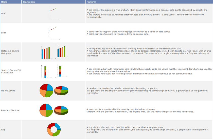
Thirteen types of charts are provided:
You can create label maps for a point, line, or region layer. Set a layer as the current layer before creating a thematic map for it. To do so, select the layer in the Layer Manager.
Note that when creating the graph map, the size is determined by the field expression corresponding to this object. So there may be the different sizes of graph maps, but they have the same fields.

