SuperMap iPortal administrator can customize the homepage contents, adjust the layout of the UI components on the home page and customize the UI components according to the portal's business requirements.
Customize Homepage Contents
The customization of portal homepage contents includes: general content, navigation settings, carousel settings, shortcut links, hot map, newest services, etc. You can also modify the CSS file to customize theme style, modify the js file to customize page title.
Log into portal home page as an administrator- > management - > site configuration, selecting the "home page custom" tab, entering the home page custom page to customize the following contents:
1. General Contents
You can set the portal's Logo, site name, copyright information, and whether to display a link to the Help document. After the setting, you can click the Preview button to see the display effect. You can click the Save button to save the information and publish it. If you want to display and hide of the copyright information , you can set it in the visual layout system.
2. Navigation Settings
- Display and Hide: Control the display and hiding of columns of level one and level two in the navigation bars.
- Dragging: You can drag columns among columns of the same level or different levels to adjust the order. For example: you can drag a column "Group" to the position below column "Resource Center" of level one. Then Group will server as level two column of Resource Center.
- Add: You can add a level one column, and you can also add columns of level two for a level one column. While adding a column, you need to enter the column name and column link address (the link address should start with http, https)
- Set built-in navigation bar: When you add a level one or level two column, you can decide whether to check "Built-in navigation bar", which is checked by default. Built-in navigation bar refers to the default navigation bar of iPortal. After you check Built-in navigation bar, the newly added navigation bar page will employ iPortal built-in navigation bar. For example, if you add a One Map column of level one, and check check Built-in navigation bar, the newly added navigation bar page will employ iPortal built-in navigation bar. You can enable or disable the Built-in navigation bar.
- Delete: You can delete added columns of level one or level two. The system default navigation bars cannot be deleted.
- Modify: You can modify the name and link address of the columns of level one or level two. For the system default columns of level one and level two, only column name can be modified.
After the setting, you can click the Preview button to see the display effect. You can click the Save button to save the information and publish it.
For how to add Develop Center in the navigation bar, please refer to Sample 1: Customize and Add Develop Center Navigation Bar。
3. Carousel Settings
- Enable Carousel: You can set whether the first page enables the Carousel effect. By default, it is enabled. If you do not enable a carousel, you need to set a single picture that will be display by default by using a radio button.
- Add Custom Carousel Picture: Adding custom carousel pictures is supported. Picture file types PNG, JPG, GIF formats are supported. It is recommended that the picture size should be 1500px*650px.
- Delete Carousel Pictures: Carousel pictures can be deleted.
After the setting, you can click the Preview button to see the display effect. You can click the Save button to save the information and publish it.
4. Shortcut Links
You can quickly enter the corresponding function module page by clicking the shortcut link button.
- Display number settings: You can set the number of shortcut links per line, with the following choices available: 4, 5, 6
- Display and hide: Support for quick link display and hiding.
- Drag: Support dragging shortcut links to adjust order.
- Modify shortcut link information: Icons for shortcut links can be modified (cannot be empty; supported pictures include PNG, JPG, GIF formats; suggested picture size is 108px*110px). The title, link address (the link address needs to begin with HTTP, HTTPS). The system default shortcut links only supports modifying icons and titles.
- Add and Delete: Allow you to add and delete cusotm shortcut link addresses.
After the setting, you can click the Preview button to see the display effect. You can click the Save button to save the information and publish it.
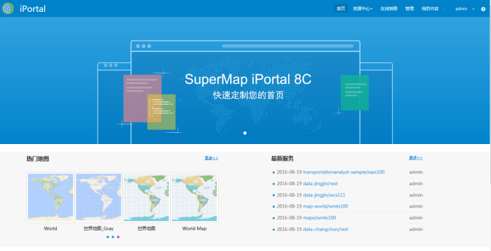
5. Hot Maps
Hots maps refer to maps with high access visits.
- Display number settings: You can set the number of hot maps on the homepage, with the following choices available: 12, 16, 20, 24.
- Display and Hide: If you want to display and hide of the hot map component, you can set it in the visual layout system.
After the setting, you can click the Preview button to see the display effect. You can click the Save button to save the information and publish it.
6. Latest Services
Latest services refer to the newly registered services.
- Display number settings: You can set the number of latest services on the homepage, with the following choices available: 6, 8, 10, 12, 14, 16. When the number of the latest services is more than 6, they will be displayed in a scrolled way.
- Display and Hide: If you want to display and hide of the latest service component, you can set it in the visual layout system.
After the setting, you can click the Preview button to see the display effect. You can click the Save button to save the information and publish it.
7. Custom Theme Styles
To implement a custom theme to meet your needs, you can edit the homeConfig_zh_CN.css or homeConfig_en_US.css under [SuperMap iPortal install directory] \webapps\iportal\WEB-INF\config directory.
8. Page title configuration
You could modify the files: iportalConfig_zh_CN.js(Chinese)and iportalConfig_en_US.js(English)under: %SuperMap iPortal_HOME%\webapps\iportal\WEB-INF\config to configurate the title of homepage, user login, user manual, map, service, application and My Content. title,Default configuration:
Title.index = "Homepage";
Title.maps = "Map";
Title.services = "Service";
Title.apps = "Application";
Title.groups = "Group";
Title.register = "User register";
Title.login = "User login";
Title.mycontent = Title.mycontent || {};
Title.mycontent.maps = "My map";
Title.mycontent.services = "My service";
Title.mycontent.scenes = "My scene";
Title.mycontent.datas = "My data";
Title.mycontent.account = "My account";
Title.mycontent.message = "My information";
Title.users = Title.users || {};
Title.users.resetpwd = "Password reset";
Title.services = Title.services || {};
Title.services.register = "Register service";
Refresh page after modification, then it works.
Sample: Modify homepage title to "guotuyun", others unchanged, configuration:
Title.index = "Guotuyun";
Title.maps = "Map";
Title.services = "Service";
Title.apps = "Application";
Title.groups = "Gruop";
Title.register = "User register";
Title.login = "User login";
Title.mycontent = Title.mycontent || {};
Title.mycontent.maps = "My map";
Title.mycontent.services = "My service";
Title.mycontent.scenes = "My scene";
Title.mycontent.datas = "My data";
Title.mycontent.account = "My account";
Title.mycontent.message = "My information";
Title.users = Title.users || {};
Title.users.resetpwd = "Password reset";
Title.services = Title.services || {};
Title.services.register = "Register service";
Refresh page after modification, then you will see the effect-"guotuyun" is instead of homepage title.
Visual Layout System
The visual layout system is primarily used to adjust the layout of UI components, and you can customize component contents according to business requirements. The entire layout system page is divided into three parts: Function Area, Layout Component Area, and UI Component Area.
1. Function Area
The function area mainly includes: edit, preview, empty, save, publish functions.
- Edit: Click the "Edit" button to start the edit mode, then you can start the flexible layout of the home page.
- Preview: Click the "Preview" button to view the overall effect of the home page layout in the visual layout system.
- Clear: Click the "Clear" button to empty the components in the layout container on the right.
- Save: Click the Save button to save the current edit or preview status to restore the current editing status for the next visual layout operation. After save operation, a file named iportalCustomHomePageTemplate_zh_CN.ftl or iportalCustomHomePageTemplate.ftl (English version) will be generated in [SuperMap iPortal installation directory]\webapps\iportal\WEB-INF\classes\templates directory.
- iportalCustomIndexEditing.ftl file: The source code file for the current edit status.
- Publish: Click the "Publish" button to publish the contents of the current layout container as the portal home page, and it will also save the current edit or preview status. After publish operation, two files, iportalCustomHomePage_zh_CN.ftl (Chinese version) or iportalCustomHomePage.ftl (English version) and iportalCustomHomePageTemplate_zh_CN.ftl (Chinese version) or iportalCustomHomePageTemplate.ftl (English version) will be generated in [SuperMap iPortal installation directory]\webapps\iportal\WEB-INF\classes\templates directory.
- iportalCustomHomePage.ftl file: The content in the <body> tag of the source code of the home page after customization.
iportalCustomHomePageTemplate.ftl file: The source code for the edit status of the layout system while publishing the home page.
2. Layout Component Area
Before you perform the UI component layout operation of the home page, you need to drag the layout components to the layout container on the right, and, of course, you can remove them from the layout container.
A layout component is a Bootstrap grid system that divides a row of the page. By default, a row can be divided up to 12 columns. An existing layout component provides: 1 row *1 column (12), 1 row * 2 columns (6 6), 1 row * 2 columns (8 4), 1 row * 3 columns (4 4 4), and custom layout component. Custom layout component allows you to arbitrarily split the number of columns and the width of columns in a custom layout component by entering an integer number combination, separated by spaces between numbers. When the summary of all numbers are 12, the component is valid.
You can drag the layout components of different rows and columns to the layout container on the right, depending on the page layout requirements.
3. UI Component Area
If you have already dragged the layout component to the layout container on the right, then you need to drag the UI component to the appropriate layout component, and, of course, you can remove it from the layout component. You operations control which UI components are displayed on the home page.
UI components are concrete implementations of the interface UI, which can be divided into system-built components and custom components.
- System-built components
System built-in components include: navigation, carousel, shortcut links, hot maps, latest services, application recommendations, copyright information.
The component contents of the system's built-in components are determined by the specific settings of the home page content customization, and there can be only one system built-in component allowed in the layout container. The number of custom components are not limited.
The number and types of built-in UI components provided by the visual layout system if iPortal are limited and may not meet the customization needs of all users. Therefore, the system provides custom components allowing the highest degree of flexibility for advanced users.
Two edit modes are provided for custom UI components:
- Visual edit mode
First you need drag a custom component into a layerout component, then click "Edit" on the custom component to enter visual edit mode. In this mode, you can use the basic editing function buttons provided by the editor to make text changes, typography, and insert of tables, pictures, videos, etc. You do not need to write front-end code. What you see is what you get.
- Source code edit mode
In this mode, you possess the highest degree of customization permissions. When you enter the source code edit mode, you can customize the final UI effect of this component by using the front-end language of HTML, JavaScript, CSS, and so on.
About how to add custom components, please refer to: Example 2: Customizing and add E-map component.
Modify Homepage CSS Style
If you need to modify the CSS style of the portal home page, you can create the iportalCustomHomePage.css file under the [SuperMap iPortal installation directory]\webapps\iportal\WEB-INF\classes\templates\css directory (if there is no classes\templates\css directory, please create one) and edit it to modify the home page CSS style.
For example, if you want to modify the shading color and height of the latest service components so that they are consistent with the hot map components, you can do this in three steps:
- Press F12 to view the source code file of the home page, locate to the "Latest service component" section, view the corresponding DOM element, such as: latestServicesDiv
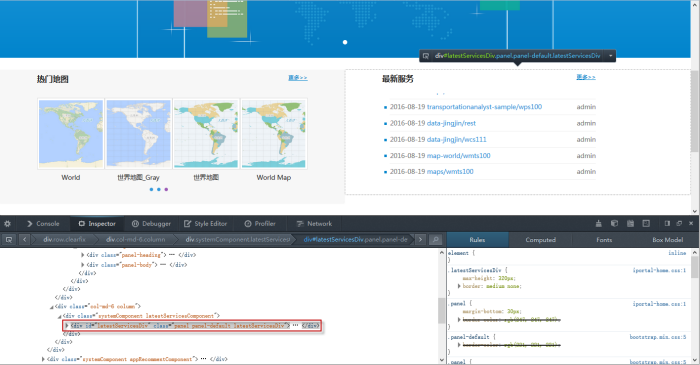
- Compile the CSS code in the iportalCustomHomePage.css file and modify the shading color and height of the latest service component, as follows:
#latestServicesDiv {
    background-color: rgb(247, 247, 247);
    max-height: none;height: 338px;
}
- You can refresh the browser to take effect.
Note:
If you want to restore the default home page CSS style, you only need to delete the iportalCustomHomePage.css file.
Customize homepage for English version site
The English version of homepage customization content and the Chinese one are stored in two seperate files, both of them are independent. You can switch the website language by selecting the option in the drop-down list in the upper right corner of the management interface, then customize the homepage content for the Chinese or English version.