Essentials
- The custom component development uses the Vue.js technology. This guide assumes that you have the Vue.js development experience, and have the knowledge of Single File Components and Listening to Child Components Events.
- Functional Component and Property Component
Each visual component displayed in the component panel of the MapDashboard WebApp corresponds to a Functional Component class at the code level. For those Functional Components which support visual modification of properties in the property panel, they also have a Property Component class. You can decide whether to include only a Functional Component or both of them in a custom component according to your business needs.
Environment preparation
Before the development, please install Git and Node.js in your machine. And install a Vue.js editor, such as HBuilderX or VS Code.
Development process
- Execute the command below to clone the sample project mapdashboard-custom-components:
git clone https://github.com/SuperMap/mapdashboard-custom-components
The downloaded project mainly contains the following contents:
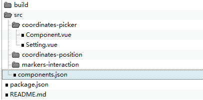
In the directory structure:
- src stores custom codes and the configuration file (components.json). This sample project contains three custom components: coordinates-picker, coordinates-position, and markers-interaction.
- In the src directory, create Component.vue (Functional Component) and Setting.vue (Property Component. The Setting.vue file is not a must if you don't need the property configuration function) files for the custom component. If there are multiple custom components, it is recommended to add a new directory under the src directory. Details: Implement a custom component?
- Register the newly created custom components in the src/components.json file. For example, the configuration for the sample coordinates-picker is as follows:
{
"CoordinatesPicker": {
"name": "Coordinates Picker",
"type": "CoordinatesPicker",
"defaultProps": {
"mode": "mousemove",
"fontSize": 14
},
"uri": "coordinates-picker/Component",
"settingUri": "coordinates-picker/Setting"
}
}
Fields introcution:
| Field | Type | Required or not? | Description |
| name | String | Y | The custom component name displayed in the component panel of the MapDashboard WebApp. |
| type | String | N | The type of the custom component. It must be consistent with the one defined in the Functional Component (Component.vue). |
| defaultProps | Object | N | Default values for the custom component property configuration items. |
| uri | Object | Y | The relative path of the Functional Component (Component.vue). |
| settingUri | String | Y | The relative path of the Property Component (Setting.vue). |
- In the project root directory, execute the following command to install the dependencies:
npm install
- After coding, now you can debug the code. For details, see: How to debug?
- Execute the command below to compile:
npm run build
The above command will compile the developed custom component into the corresponding js file. After the compilation process is over, a dist directory will be generated under the project root directory, which contains the js file and a copy of the components.json defined in step 3.
- Copy the dist directory generated in step 6 to [iPortal product package] /webapps/iportal/resources/mapDashboard/customComponents/ and access iPortal in the browser. After logging in, click "MapDashboard" in the navigation bar, in the loaded MapDashboard WebApp, select "Components" in the left panel, you can see the newly extended component in the Custom Components area (No need to restart iPortal).
Note: If the extension effect doesn't show in step 7, please refresh the page, or delete the browser cache, and try again.