


Border Settings
Borders checkbox is used to control whether the currently selected map in the layout has borders. It provides two border types: Single-line and Complex. After setting the border type, configure the style parameters for the single-line or complex border.
 |
 |
| Single-line | Complex |
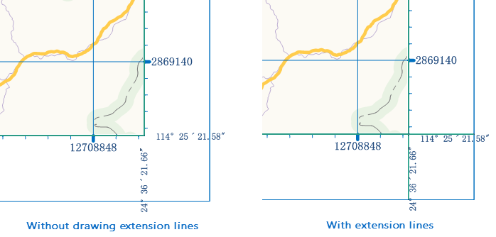
- Draw Corner Extension Lines: Check this checkbox to extend the outer frame line of the graticule to the map border. For a complex border, it extends to the inner frame of the border. If the graticule labeling settings include corner labels, the corner extension lines and corner labels will not overlap, and they are displayed without overlap by default. The corner extension lines are shown in the following image:
- Single-line: Sets the border type of the selected map to single-line.
-
- Line Style: Click the "Select Line Style" drop-down button to open the line symbol library resource list. Users can select symbols from the list as needed, or click the "Symbol Design..." button at the bottom of the line symbol resource list to add other symbol library files in the pop-up "Symbol Library" window, setting them as the line style for the current single-line.
- Line Width: The numeric display box to the right of this label is used to set the line width of the single-line border, defaulting to 0.1 mm.
- Color: Sets the color of the single-line. Click the drop-down button to the right of this label to open a color panel. Users can choose a predefined system color or customize a color to set as the color for the single-line.
- Distance: Indicates the distance from the current border to the inner map. When the user selects single-line, the numeric display box to the right of the "Distance" label is grayed out and unavailable.
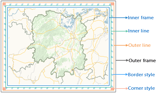
- Complex: When the map's border type is complex, the border structure is divided into outer frame, inner frame, outer line, inner line, border corner areas, and border fill areas. By setting the line style, color, thickness of various line frames, and filling the area parts, the map's border can be decorated to meet user needs.
- Inner Frame/Inner Line/Outer Line/Outer Frame: When the geographic border is set to complex, use inner frame/inner line/outer line/outer frame to set 0-4 frame lines for the complex, and configure their line style, width, color, and spacing. The setup methods for various frame lines are the same as for the single-line. If the width of a frame line is set to 0, that frame line will not be displayed. Distance indicates the distance between the current line frame and the inner line frame; for the inner frame, it represents the distance to the inner map boundary.
- Border Style: The border style tab below the "Layout Map Properties" window is used to set the fill content and fill direction for the area between the inner line and outer line in a complex border.
- Fill Direction: The system provides two rotation bases for the fill pattern: from outside to inside (default setting) and from inside to outside. From outside to inside means the fill pattern fills from the outer line towards the inner line; from inside to outside is the opposite, as shown in the figure above.
- Fill Settings: The fill settings area is used to set the fill pattern between the inner line and outer line. The system provides three fill methods: no fill, text fill, and picture fill, with no fill as the default.
- No Fill: There is no fill content between the inner line and outer line.
- Text Fill: The area between the inner line and outer line is filled with text. Users can enter text, numbers, or symbols in the text box to the right of the "Content:" label. They can choose the font and color; the text content can be selected or entered manually, but only up to 2 characters can be displayed. Users can click the drop-down button to the right of "Text Style:" to open a font styles dialog, where they can set the style of the fill text. For specific setup methods, refer to the "Style" tab on the Modify Uniform Label Map Style page.
- Picture Fill: The area between the inner line and outer line is filled with an image. Select "Picture Fill", and the button below this label
 becomes available. Click this button, and in the pop-up "Open" dialog, select an image for filling. Imported picture formats can be: *.bmp, *.jpg, *.png, *.gif.
- Corner Fill: The corner fill tab below the "Properties" window is used to set the fill content and fill direction for the four corner areas between the inner line and outer line in a complex border.
- Starting Mode: The system provides four rotation bases for the corner fill pattern: bottom-left, top-left, top-right, and bottom-right. The default starting mode is top-right, meaning the pattern at the top-right corner of the border is in the normal view, while the patterns at the other three corners are rotated 90 degrees sequentially, as shown in the figure above.
- Fill Settings: The fill settings area for corner fill is identical to that for border style. Refer to the setup methods above for details.