



The display effects of labels directly affect the aesthetics of the whole map. However, there are no strict standards to follow for what makes annotation text beautiful; it all needs to be adjusted based on your map background. Here, we share some tips and experiences for styling text using SuperMap, hoping to assist your cartographic work.
- Font
First, choose an aesthetically pleasing font. Different fonts have stylistic differences that affect the map's tone, especially fonts with many characters, which have a greater impact. For example, sans-serif fonts are more rigid, rounded fonts and Kai-style fonts are softer, while Song-style and FangSong-style fonts strike a balance. You can also add font libraries not provided by SuperMap software to meet your application needs. Currently, in SuperMap software's electronic cartography, WenQuanYi MicroHei is often used for road labels along lines, providing better display effects.
- Font Size
When setting annotation size, avoid making text too small or too large; it should be clear without wasting space. Consider people with poor vision but avoid solely using large fonts. Generally, size 8 font meets this requirement. Then, you can increase or decrease the font size based on annotation importance. To enhance the hierarchical sense of the map surface, do not use a single font and font size throughout a map.
Note that the font sizes mentioned here refer to Office Font Compatibility, meaning you must check the "Office Font Compatibility" checkbox in the "Map Properties" dialog box; otherwise, the SuperMap font size standard is used, which is much smaller than the same size font in Office software.
- Multi-line Text Annotation
When map annotation content is long, it is generally not recommended to use single-line display. Line breaks can be employed to make the map aesthetically pleasing and space-efficient, allowing more annotation content to be shown.
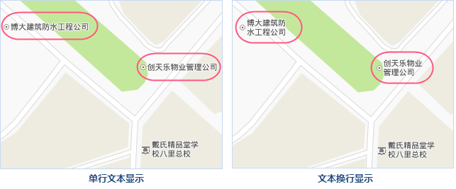
Figure: Comparison of Single-line and Multi-line Text Display In the "Advanced" properties tab of the label thematic map, a feature for handling overly long annotations is available. You can display annotations with line breaks, control the break position (using "Single-line Text Count" to specify characters per line before breaking), and set the alignment of multi-line text after breaking.
If the annotation remains too long after line breaks, you can display it with ellipsis, showing only a specified character count and omitting the excess with "…".
- Label Text Effects
SuperMap provides rich text effects, such as bold, italic, shadow effect, outline effect, rotation effect, and background effect. Whether to use these depends on map composition needs; they serve to highlight key points and harmonize text with the map background. Therefore, avoid excessive text effects on annotations to prevent a cluttered appearance.
- Text Outline
The role of text outline is primarily to beautify text and improve clarity to some extent. As shown below, this map displays image and vector data overlay with a dark overall tone. Annotations without effects make the whole map appear dull; adding a white outline makes it eye-catching.
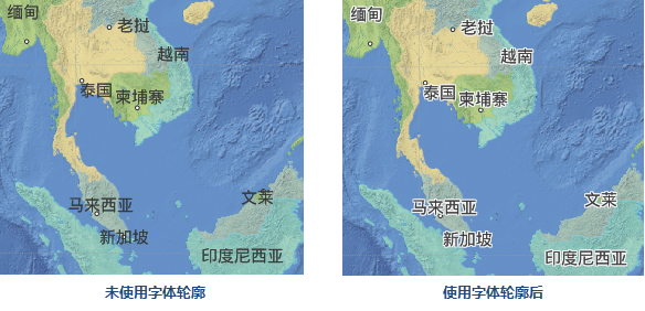
Figure: Comparison of Font Outline Display Text outline can also balance text color with the map background, preventing the text from appearing too abrupt.
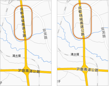
Figure: Comparison of Font Outline Display To some extent, text outline enhances clarity. As shown below, annotations for water areas typically use blue tones, matching the blue water itself, making the text less noticeable. Adding an outline separates text from the background, indirectly improving clarity.
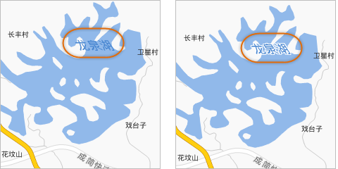
Figure: Comparison of Font Outline Display How to Set Text Outline
- In the "Style" tab area of the "Thematic Map" property dialog, first check the "Transparent BG" checkbox, then check "Outline" for text outline settings to take effect.
- In "Background", set the color of the text outline.
- Finally, adjust the outline thickness in pixels.
- Text Background
When "Transparent BG" is unchecked in text effect settings, text has a rectangular background colored by the "Background" setting. Another type is creating a label thematic map with a background, allowing text background shapes or point symbols as backgrounds. For how to create such maps, refer to other articles.
- Text Tilt Effect
Text tilt and rotation are mostly applied to annotations for water systems and mountains. Typically, such text should tilt left by 45 degrees. This effect is only achievable with label thematic map text. In the "Style" tab of the "Thematic Map" property dialog, you must first check "Italic" to enable "Tilt Angle", then set the left tilt degree—here, 45 degrees.
- Text Outline