


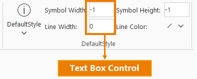
Text Box Control <textBox>
The text box control corresponds to the <textBox>...</textBox> tag. To add a text box control to the interface, simply add <textBox>...</textBox> tags with appropriate attribute settings. To add multiple text box controls, simply add corresponding <textBox>...</textBox> tags.
Below is a detailed explanation of the attributes in the <textBox>...</textBox> tag:
<group.....>
    ......
    <textBox index="2" name="default speed:" text="" onAction="CtrlActionSceneRouteSpeed" visible="true"
				screenTip="specify the flying speed for the current flying route." screenTipImage=""/>
    <textBox index="3" name="duration:" text="" onAction="CtrlActionSceneRouteTimeLength" visible="true"
				screenTip="specify the flying speed for the current flying route." screenTipImage=""/>
    ......
</group.....>
- index: Determines the sorting order of textBox controls when multiple controls exist at the same hierarchy level.
- nullValuePrompt: The prompt text displayed when no content is entered in the text box.
- visible: Specifies whether the textBox control is visible. true indicates visible, false indicates invisible.
- onAction: Executes the specified action when text input is completed (Enter pressed) or when the control loses focus. This can be set to a class inheriting CtrlAction or implementing ICtrlAction interface.
- label: When both this property and screenTip are set, the label value will be displayed as the title in the screenTip prompt.
- screenTip: Specifies the prompt text displayed when hovering over the textBox control.
- screenTipImage: Specifies the full path of the image displayed when the mouse is moved over.
- customProperty: Reserved for users to set custom attributes.