


Numeric Control <spinner>
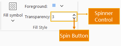
The following figure shows a numeric control:
In the configuration file, each numeric control corresponds to a <spinner>...</spinner> tag. To add numeric controls to the interface, simply insert <spinner>...</spinner> tags with appropriate attribute settings. Multiple numeric controls require multiple <spinner>...</spinner> tags. The following section details the attributes of the <spinner>...</spinner> tag:
<group id="FillStyle" index="12" label="fill style" ......>
    ......
    <spinner index="0" name="transparency:" visible="true" onAction="CtrlActionFillOpaqueRate" minValue="0" maxValue="100" increment="1" />
</group>
- index: Determines the sorting order of numeric controls when multiple controls exist at the same hierarchy level.
- name: Specifies the control name. Required parameter.
- minValue: Specifies the minimum value for the IntegerUpDown.
- maxValue: Specifies the maximum value for the IntegerUpDown.
- increment: Specifies the step size for the IntegerUpDown.
- onAction: Triggers specified actions when the numeric value changes. This attribute can reference a class inheriting CtrlAction or implementing the ICtrlAction interface.
- visible: Controls the visibility of the numeric control. True indicates visible, false indicates invisible.
- value: Specifies the default value for the IntegerUpDown.
- screenTip: Defines the tooltip text displayed when hovering over the control.
- screenTipImage: Specifies the full path of the image displayed during mouse hover.