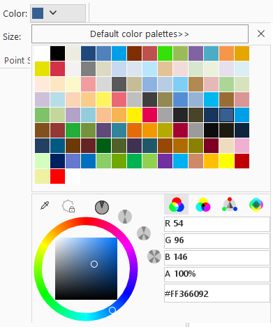
Color Button Control<colorButton>
In the configuration file, the color button control corresponds to the <colorButton>...</colorButton> tag. To add a colorButton control to the interface, simply add the <colorButton>...</colorButton> tag and configure its attributes. To add multiple colorButton controls, include multiple corresponding <colorButton>...</colorButton> tags.

The following section details the attributes and functions of the <colorButton>...</colorButton> tag:
<group ......>
    ......
    <colorButton index="0" label="Background Color" image="../resources/LayoutView/Icon/LayoutStyle/TextStyle/BackColor.png"
				 onAction="CtrlActionTextStyleBackcolor"
                 screenTip="Sets the font of the selected text object in the current text layer to italic.\nThe button is highlighted when italic is applied; otherwise, it remains in normal style."
                 visible="true" style="SMALL" platform="All" language="All" />
    <colorButton index="0" label="Foreground Color" image="../resources/LayoutView/Icon/LayoutStyle/TextStyle/TextColor.png"
				 onAction="CtrlActionTextStyleForeColor" screenTip="Sets the text color of the selected text object in the current text layer."
                 visible="true" style="SMALL" platform="All" language="All" />
    ......
</group>
| Attribute | Description |
| index | Used to sort colorButton controls. When multiple colorButton controls exist at the same hierarchy level, their display order is determined by this attribute. |
| label | Display name of the color button. |
| image | Path to the image displayed on the colorButton control. Only relative paths to the application are supported. Note: The image must be located on the same disk as the application. |
| onAction | Specifies the action to execute when the color value changes. This attribute can reference a class that inherits CtrlAction or implements the ICtrlAction interface. |
| screenTip | Tooltip text displayed when hovering over the color button. |
| screenTipImage | Image path (relative to the application) displayed in the tooltip when hovering over the button. |
| shortcutKey | Shortcut key combination for the Gallery button control. Format: [Ctrl] + [Alt] + [Shift] + [KeyName]. Example: Ctrl + C for copy operation. |
| visible | Determines the visibility of the color button. true indicates visible, false indicates hidden. |
| style | Display style: BIG (large icon with text below), MEDIUM (small icon with inline text), SMALL (icon only without text). |
| platform | Supported operating systems: All, Windows, or Linux. All indicates cross-platform support. |
| customProperty | Reserved for user-defined attributes. |


