


CheckBox Control <checkBox>
In the config file, each CheckBox control corresponds to a <checkBox>...</checkBox> tag. To add a CheckBox control to the interface, simply include the <checkBox>...</checkBox> tag with appropriate attribute configurations. Multiple CheckBox controls can be added by including multiple <checkBox>...</checkBox> tags accordingly.
The following section details the attributes within the <checkBox>...</checkBox> tag:
<ribbon id="view" index="6" label="View">
    <group id="View" image="../resources/Group/Icon/View/View.png" index="1" label="View" rowCount="3" visible="true">
        <checkBox checkState="true" customProperty="" image="" index="1" label="Workspace Manager Window"
					onAction="CtrlActionWorkspaceManagerWindow"
					screenTip="Controls whether the workspace management window is displayed, which supports resources like datasources and maps, similar to the operation resource manager file."
					screenTipImage="" visible="true" width="0"/>
        <checkBox checkState="true" customProperty="" image="" index="5" label="Catalog Manager"
					onAction="CtrlActionCatalogManager" screenTip="" screenTipImage="" visible="true"/>
    </group>
</ribbon>
- index: Used to sort CheckBox controls. When multiple CheckBox controls exist at the same level, their display order is determined by this attribute value.
- label: The display name of the CheckBox control.
- visible: Determines the visibility of the CheckBox control. true indicates visible, false indicates hidden.
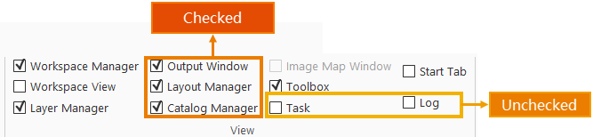
- checkState: Default state of the CheckBox control. true represents checked, false represents unchecked.
- onAction: Specifies the action triggered by the CheckBox's selection event. This attribute can reference a class that inherits CtrlAction or implements the ICtrlAction interface.
- screenTip: Displays prompt text when hovering over the CheckBox control.
- screenTipImage: Specifies the icon displayed on the CheckBox control. Only supports relative paths to the application. Notes: The image must reside on the same disk as the application.
- shortcutKey: Defines the keyboard shortcut for the CheckBox control, equivalent to clicking the control. Format: [Ctrl] + [Alt] + [Shift] + [KeyName].
- customProperty: Reserved for user-defined attributes.
- width: Specifies the width of the CheckBox control in pixels.