


Button Control <button>
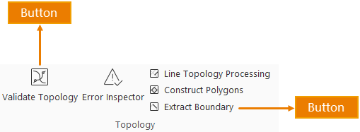
The figure below shows a button control. The display content consists of two parts: the image represents the button icon, while the text represents the show name. Clicking the button triggers its bound functionality.
In the config file, each button control corresponds to a tag. To add button controls to the interface:
- Add tags
- Configure tag attributes accordingly
Multiple button controls require multiple tags. The following details each attribute's meaning and usage:
<!-- "Data" Tab -->
<ribbon index="1" label="Data" id="data">
  <group index="0" image="../resources/Group/Icon/Data/Topo.png" id="Topo" label="Topology" visible="true" rowCount="2">
	  <button index="1" label="Validate Topology" visible="true" checkState="false" onAction="CtrlActionTopoCheck" style="MEDIUM"
              image="..\resources\Topology\Icon\Topo\TopoCheck_32.png" screenTip="Perform to check objects that do not match topology rules for point, line, and area data, and between different dataset types."
              screenTipImage="" customProperty=""/>
	  <button index="2" label="Line Topology Processing" visible="true" checkState="false" onAction="CtrlActionDatasetLineTopo"
              image="..\resources\Topology\Icon\Topo\LineDatasetTopoCheck_32.png" screenTip="Perform topology processing on line datasets and network datasets."
              screenTipImage="" customProperty="" style="MEDIUM" Key="iobjects_topology-com.supermap.topology.topologyprocessing-clean"
              ClassName="com.supermap.desktop.datatopology.workFlow.CustomUIDatasetLineTopo"/>
	  ......
  </group>
  ......
</ribbon>
- ID: The unique identifier of the button. Buttons with same IDs across config files will be merged.
- index: Determines button sorting order within the same hierarchy level.
- label: The display name shown on the button.
- image: Relative path to the button icon (relative to application). Note: Image must reside on the same disk as the application.
- onAction: Specifies the action triggered by button click. Click ... to select designated plugin and specific class in the dialog.
- screenTip: Tooltip displayed when hovering over the button.
- screenTipImage: Relative path to supplementary image in tooltip (relative to application).
- shortcutKey: Defines keyboard shortcut equivalent to button click. Format: [Ctrl] + [Alt] + [Shift] + [KeyName]. Example: Set as "[Ctrl] + [C]" for copy shortcut.
- visible: Controls button visibility (true=visible, false=hidden).
- size: Display style options:
- BIG: Large icon with text below
- MEDIUM: Small icon with inline text
- SMALL: Icon only
- customProperty: Custom attributes defined in code. Example: Setting "Splice" for a function button enables "New Dataset" checkbox by default in Raster Splice/Update dialog.