Add button
The large screen supports adding buttons, binding existing desktop functions to the buttons, and setting button color, icon, size and other attributes. When you Full screen Preview the large screen, you can click the button to achieve the corresponding operation, so as to improve the interactivity of the large screen.
Description of main operation and configuration
Add: On the Ribbon menu bar, click the Large Screen-> Function Button button to add the Default Size button to the Uppe-left corner of the window.
Button Property Settings
- Position: The position and size of the text element in the large screen can be adjusted. For detailed Parameter Description, please refer to Common parameters .
- Border: Text Border Color and effect can be set. For detailed Parameter Description, see Common parameters .
- Attribute:
- Name: Set the Function Name displayed in the button, which can be empty;
- Icon File: Click the Select button on the right, and select the *.svg or *.png picture as the function icon in the file dialog box. The Display Size of the picture is the same as that of the original picture.
- Link Function: Set the function to be executed when the button is clicked. It can be bound to the function provided by the desktop or Secondary Development. There are two binding methods:;
- Drop-down Selection: Click the Drop-down Button on the right to select the function to be bound in the drop-down options. After clicking the Drop-down Button, you can enter the keyword Function Name to search. It also supports up and down keys to switch between Search Results.
- Mouse picking: Click the button on the right
 , click the left mouse button in the Ribbon to select the function to be bound with the large screen button, or cancel the binding operation through the Esc key.
- Background Transparency: After the check box is checked, press the button Background Transparency.
- Background color: When Background Transparency is not checked, you can set the background color of the button in the drop-down color panel.
- Select background color: When Background Transparency is not checked, the background color of the button can be set when the mouse moves to the button.
- Font: Set the text font family. The default font type is Microsoft YaHei.
- Font Size: Set Font Size, and the default size is 30.
- Text Style: Set the font display style. Bold and italic styles are provided.
- Text Color: Click the color control to set the Text Color in the drop-down panel.
- Select Text Color: Set the color of the text when the mouse moves to the button.
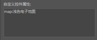
- User-defined Control Attribute: The function of Secondary Development, where you can assign values to related parameters. For example, if the function of Switch Map is customized, you can assign values to the Map Name parameter map here. The assignment method is: map: Light Digital Map.

Related content


