You are allowed to change border settings according to your demand.
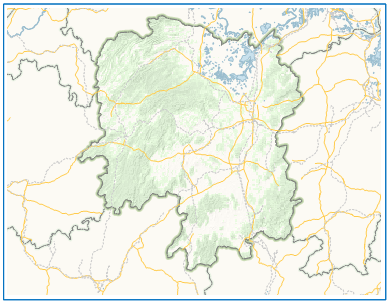
The checkbox Borders is used for controlling whether to display the borders of the selected map in your layout. iDesktop provides two types of borders: Single-line and Complex. You are allowed to set styles for any kind of lines you choosed as well.
 |
 |
| Single-line | Complex |
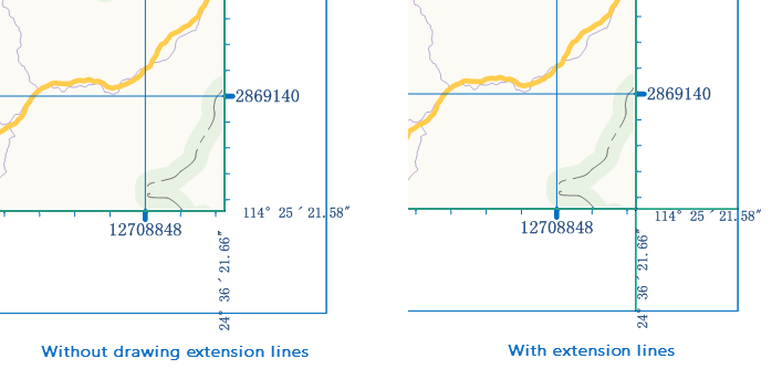
- Extent Corner Lines: This checkbox controls whether to extend the border line of a grid to the map frame (inner frame for complex frames). iDesktop will display corner extension lines and corner labels without overlapping each other by default when you add them together.

- Single-line: To display the selected map with single-line borders.
- Line Symbol: Specifies the line symbol applied to the borders. You can click the Select drop-down button to display the line symbol list, and select one from the list. Alternatively, you can click the More Symbols button at the bottom of the list, customize a symbol according to your own preferences, and then apply it.
- Width:Speicfies the width of the single-line borders for the selected map. By default, the width is 0.1 millimeters.
- Color:Specifies a color, either a pre-defined or self-defined one, for the single-line borders of the selected map.
- Distance: Specifies the distance between the current border and the inner map. This control will not be available if you check the Single-line box.
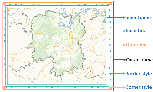
- Complex: To display the selected map with complex borders, which are composed of an outer frame, an inner frame, an outer line, an inner line, 4 corners regions and 4 fill regions. You can set a style for each component according to your own preferences.
- Inner Frame/ Outer Frame/ Inner Line/ Outer Line: You can set the line symbol, line width, line color and distance for each of the four. The line or frame will not be displayed if you set the line width of it to 0. Distance specifies how far awasy the current frame or line is from the inner frame or line. The Distance parameter for inner frame sets the distance between the frame and the inner map.
- Region Fill:Specifies how you want to fill the regions between the outer line and the inner line, or the fill regions.
Direction:Specifies a fill mode. You have two options: From Outside In (default) and From inside Out.
Fill Settings: Sets a fill pattern. Three options are provided: Text Fill, Image Fill and None (default).
(1)None:Not to fill the fill regions.
(2)Text Fill:To fill the fill regions with text. You can input the text with which you want to fill the fill regions in the Text Content box. To set the style for the specified text, click the Text Style drop-down arrow and set parameters in the dialog box that appears. To get more detailed information on how to set the text style, please refer to How to set text Styles (The styles tab section in the Uniform Style Label Thematic Map page).
(3)Picture Fill:To fill the fill regions with images. When you check this box, the Browse button
 below will be available for you to specify an image in .bmp, .jpg, .png or .gif fromat.
 - Corner Fill:Specifies how you want to fill the four corner regions.
Direction:Specifies from which corner you want to begin filling the corner regions. You have four options: Upper Left, Lower Right, Upper Right , and Lower Right. By default, Upper Right is selected, which indicates that the upper left corner will be filled with the text or image you specify in the normal view. However, the Lower Right, Lower Left, and Upper Left corner will be filled with the text or image with a respectively 90, 180, and 270-degree rotation.
Fill Settings:please refer to the Fill Settigns section for Region Fill.